Archive for February, 2011
The Merry Chase
Clement Hurd | Chronicle Books 2005
Initially published 1941

Once again, I am reminded how simple and playful children’s books should be. The Merry Chase was written and illustrated by Clement Hurd in 1941, best known as the illustrator of classics like Goodnight Moon and Runaway Bunny. With the thread of a dog pursuing a cat, we are taken on a high-speed chase that wrecks more property and probably injures more people than the running of the bulls. Vibrant full-page illustrations show runaway baby carriages, spilled pots, table cloths catching fire, head-on car crashes, spilled paint and toppled wedding cakes—all havoc wreaked by the hound and feline. But the best part is the people—not one of them has their feet on the ground! They are all caught midstream before breaking a tailbone, getting scalded, hitting a head, drowning or getting knocked out by a toppling statue. Each page reveals a catastrophe unfolding and about to get worse. It’s stop-motion animation in book form. The illustrations are painted in a Matisse-like palette with simple flat colors and minimal tonal shading—an amazing feat to create such energy with such a primitive style of rendering. If proposed today, I doubt the lawyers would let it see print. I’m thrilled to see it reissued—disaster never looked so fun!
What words?
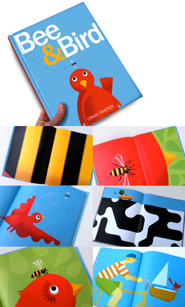
My next book, Bee & Bird, is about to hit the shelves in May. I’ll tell you already—it’s got no words. No, it’s not half-baked, it just ended up that way. I know what you’re thinking, it must have been easy—no editor! The truth is I worked with my editor, Neal Porter, tirelessly to make this book work without words. After publishing Hank Finds Inspiration with Neal and Roaring Brook Press, we have a good working rapport that usually takes place over the phone, over coffee, or preferably over cocktails. Neal points and I sketch. He initiated this book with “how about something really bold and graphic, really different.” Following remarks were like “no, no, not that, any other ideas?”
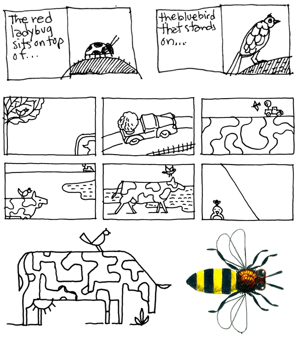
I’ve always been fascinated with image cropping from my years as a designer. How little information does it take to tell a story? A tightly cropped image can often extend well past the edges of the page. The book can become virtually huge. So I showed Neal some initial sketches along those lines—each page revealing more information and a fresh point of view.
My initial sketches had words and we both felt an urge to eliminate written narrative. Over the next month we batted the storyline around until we felt it stood on its own. The rest of the year was spent making the final drawings which is always the best part.
 The exciting opportunity I saw was to produce very graphic and geometric illustrations—reminiscent of 80’s Swiss graphics that I was schooled on. I got out my T-square and circle templates—sorry Adobe.

Without giving away the story—you already know the main characters in Bee & Bird. In short, it’s a story about companionship, separation, and reunion without words. Believe me, we really thought hard about the merits—or not—of a wordless book. We kept coming back to thing that kids and parents love, that is, to contribute your own version of the story. A book to teach reading this is not. A book to teach storytelling it is. Look for it this May or pre-order it now. Don’t worry, I’ll remind you.
Crazy Days
Taro Miura | Tate Publishing 2009

Crazy Days is a theme book with a dozen fantastic ‘what’s wrong with this picture’ spreads. I’m a huge fan of illustrations with smart riddles or ‘switcharoos’ —and Taro Miura pulls it off stylishly cover-to-cover. This book says to a kid, (and their parents), anything is possible if you can see it. Wouldn’t the world be grand if trees were full of music, clouds were sheep, horns blew bubbles and ships could fly? With bright, simple and loosely airbrushed illustrations these are indeed crazy days—and I like it!


