Archive for September, 2010
This is Silly!
Gary Taxali | Scholastic Press 2010
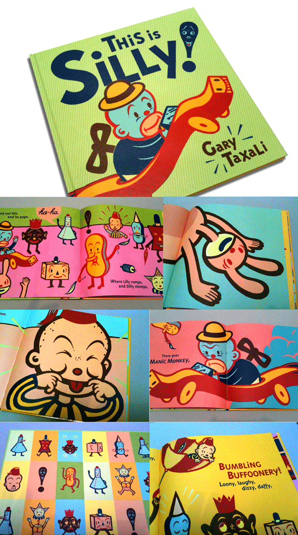
It’s evident that Gary Taxali’s first book comes from a personal place. He recounts that he had a “slew of teachers growing up, on in particular, that would tell him to ‘stop being silly’.” On the contrary, his mom always encouraged his urge to draw zany pictures and laugh. This is Silly sets out to follow his mother’s insistence. It is an incredible visual playground filled with bold, graphic illustrations of 30’s style characters like Silly Willy, Silly Sol, Lilly, Dilly, Billy and Manic Monkey. This is Gary’s world—a candy store of color, patterns and ambassadors of fun. Pink, magenta, lemon yellow, turquoise, mint green and rich crimson flood the pages and shout “loosen up, we’re partying here!” Mischief, mayhem and catastrophe befall the silly characters described in his text as “bumbling buffoonery and tumbling tomfoolery.” This is the kind of inspiration kids—and their parents—to cultivate the creative mind. Bravo to Gary for ‘paying forward’ his own childhood inspiration.
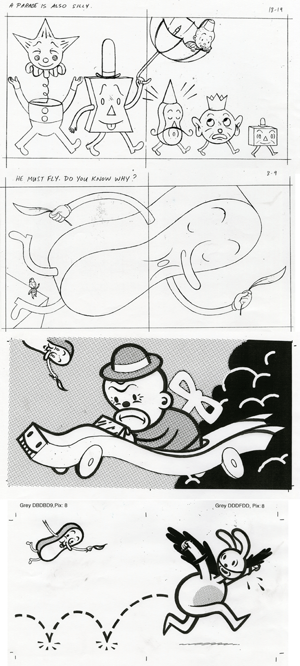
Gary tells me that the drawings were easy for him but the words were challenging. Some of the silk-screened illustrations used 17 colors and 11 screens. No evidence of technology here! I asked him what was most satisfying and he said, “getting the response from children who like it. If I inspire one kid to act silly, well you know the rest.” You inspired one adult that I know.
The Quiet Book
Written by Deborah Underwood | Illustrated by Renata Liwska | Houghton Mifflin Harcourt 2010
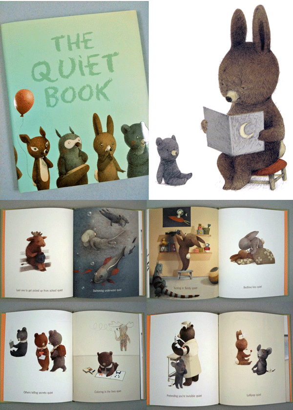
Smartly (and quietly) written and brilliantly illustrated. Renawta Liwska has graced the pages of The Quiet Book with the most adorable and expressive little creatures. Loose but masterful graphite drawings tinted with soft pastel colors—these owls, bears, moose, porcupines, birds, iguanas and rabbits draw us into exact moments in time where quiet is the requirement. Like the lonely moose that sits in silence as the last one to be picked up after school. If a moose could look sad, this is what it would look like. Or, the content mouse and rabbit licking wordlessly on their lollipops.
The design, color and rendering of every one of these pages are considered and restrained—quiet and very loud drawings. Most of the animals are four-legged—but stand on two and portray human expressions and gestures to the tee. They are both sweet and necessarily mischievous. This book is a soft jewel.
In her words:
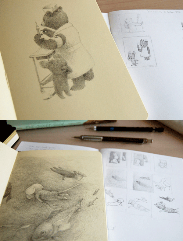
Renata tells me that the most challenging aspect of making this book was to work tirelessly to the bitter end! Hard to believe, but she says that at times “ I didn’t have any drawings in me. And at the end I was out of gas and it was particularly difficult to finish up the last few illustrations.” The struggle doesn’t show!
How does she draw those adorable animals? “I do and I don’t use reference. I do look at pictures and videos of animals. I look at how they are constructed. What sorts of noses and paws they have or what are their proportions and such. But I try to interpret the reference in my own way and create an impression of the characters.”
Renata credits her interest in drawing animals to watching the stop-motion kid’s TV shows called Coralgol, aka Jeremy the Bear, or Barnaby.
Renata assures us there are more adorable creatures to come.
Lots of Dots – Just released!
Craig Frazier | Chronicle Books 2010

Face it, dots are fun. They are fun to draw and fun to see—and even more fun to spot in unusual places. Lots of Dots features one of the most beautiful shapes around—the circle, or dot—and all the obvious and not-so-obvious places that it appears. Clean, bright and graphic illustrations are put to rhyme taking us through a menagerie of scale, pattern and opposites. “Some dots are big, some dots are small. Some dots float, and some dots fall.” Are those buttons or just dots? Are those eggs or dots? And those wheels on that car—they’re dots! Lots of Dots is a visual celebration of observation that promises to make parents see again like kids.
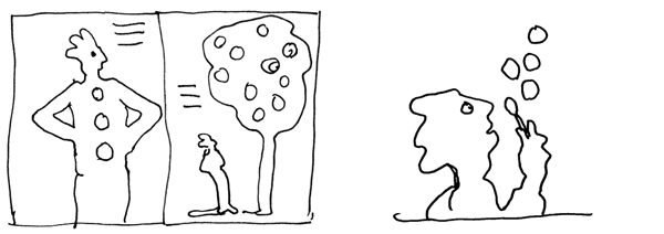
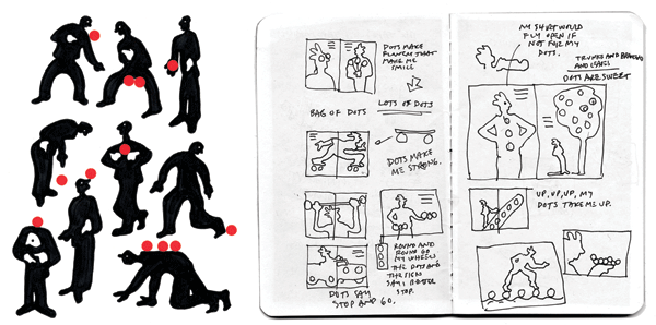
This book originated from a random sketch in my sketchbook a few years back. I was playing with stick-on dots with this wacky silhouetted character. I was attracted to the simple isolation of both forms—the figure and the dots. With hope of a theme, I started sketching where dots are apparent. My initial fret was not having enough material to fill 36 pages. Eventually, the images came—as did the rhyming words. I had a lot of fun working with the scale of the illustrations and the coloring. Each final illustration was built from a scanned sketch that was traced and improved in Illustrator. A less-is-more-kind of book. Lots of Fun!
The Three Little Pigs, an Architectural Tale
Steve Guarnaccia | Abrams 2010
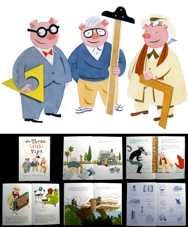
Following the success of his first designer-adapted fairy tale, The Three Bears, Steven Guarnaccia takes on the classic Three Little Pigs with equal aplomb. Stephen tells me, “I realized that The Three Pigs was ready-made—the pigs are literally the architects and builders of their own homes. It was a short step from the initial idea to choosing some of my favorite architects and their houses.”
Clearly a design aficionado, Guarnaccia sets out to pay homage to some of his heroes. “My goal was to introduce children to everyday, albeit extraordinary, design. They’re taught the names of authors and fine artists from an early age, but the applied arts are often overlooked.”
The book is a retelling of the original story except the pigs are famous architects Frank Lloyd Wright, Philip Johnson and Frank Gehry. It’s chock-full of design references and iconic work by the pigs and others like Noguchi, Saarinen, Starck, Sottsass, and many more. Steven nails the idiosyncrasies of the 3 architects from their glasses, shoes and hats to their signature homes. He gives away his bias for Wright’s home, Fallingwater, or maybe it’s the only one that is built to withstand the blow of the wolf in leather?
![]()
Steven’s graphic watercolors serve to take us on a tongue-in-cheek design history journey. My favorite drawings are the endpapers that portray design icons in one color with hand-drawn lettering crediting the creators. Steven says, “I chose those objects with which I had the most affinity. Many of these 20th century artifacts seem to me to be illustrations in three-dimensions to begin with.”
This is a great intro to design for children and a testament to the love of the subject from one legendary designer (illustrator) himself.
Steven Guarnaccia is the Program Chair & Associate Professor at Parsons The New School for Design, NYC
Forever Friends
Carin Berger | Greenwillow Books 2010
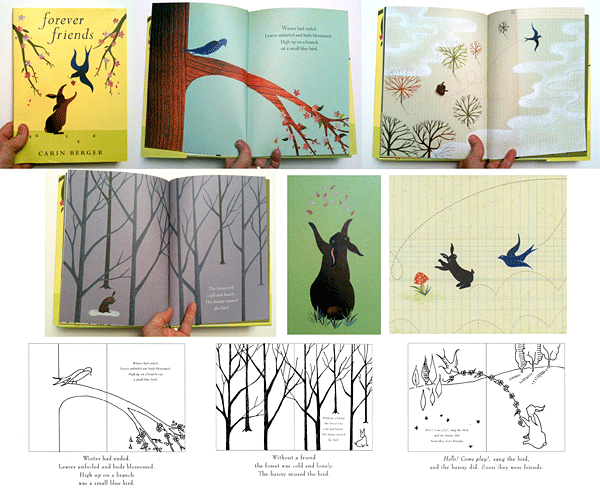
This is a beautiful book in all regards by the talented Carin Berger. In the spirit of her earlier book, The Little Yellow Leaf, Forever Friends is a timeless story for all of us. Carin tells me her inspiration, “The story grew from the fact that we were (once again) leaving home for an adventure—5 months in Japan—and my daughter was struggling with leaving her friends behind, and I was too. I was thinking about how often—throughout our lives—trusting that a relationship can weather time and distance is an issue, starting really early on when a parent leaves a child with a sitter or at school.”
Carin’s illustrations are a breath of fresh air in the world of polished digital art. Starting with simply drawn sketches to establish scale and content, she cuts and pastes her final art from colored paper, magazine clippings, receipts and IRS documents. She adds touches of shading, rubber stamps and texture. Each illustration carries with it a history and soul that is rich beyond it’s obvious storytelling.
The poses and gestures of the bird and bunny (and other wildlife) are precious and make you want to live peacefully in a graph paper landscape. Just splendid.
