Waterlife
Rambharos Jha | Tara Books 2012 | Limited Edition | 28 pages

Waterlife is a very special book. It is fit for any child’s bookshelf or adult’s coffee table. Whereas there is no storyline in the traditional picture book sense, there is a story in its art and the making of the book. Illustrated in his version of the Mithila tradition of folk art, artist and author Rambharos Jha depicts several creatures of the water in 12 spreads. Each creature is accompanied by a few sentences describing its significance to his culture, his upbringing and his experience drawing it. Each of these briefs is rich with reference to a culture of symbols and motifs. Each one provides clues to the place that the creature has in Jha’s life and imagination. Collectively, they paint not only a picture of water life but the artist’s life.
The Trick
This is my picture-tribute to a well-known fable from the ancient Indian story collection, Panchatantra. A crane visits a shoal of fish living in a pond. He warns them of an impending drought. He offers to save the fish, by carrying them away, one by one, to another pond with plenty of water and food. The fish agree. But very soon we realize what is going on…the fish become food for the crane!
This is a limited edition book that has heirloom written all over it. Each illustration is made of a patient compilation of fine lines, textures and patterns, colored in the most luscious and restrained palette. Each illustration exhibits a charming innocence while at the same time a commanding mastery of the medium. Jha’s technique of finely woven lines makes each illustration hypnotically undulate as if it were alive. They are screen printed by hand on a highly textured hand-made cotton paper. They are printed and bound in India. This is a perfect gift book for a 6-year old, college graduate, or retiree.
Safari
Dan Kainen and Carol Kaufmann | Workman Publishing Company 2012
The video cannot be shown at the moment. Please try again later.
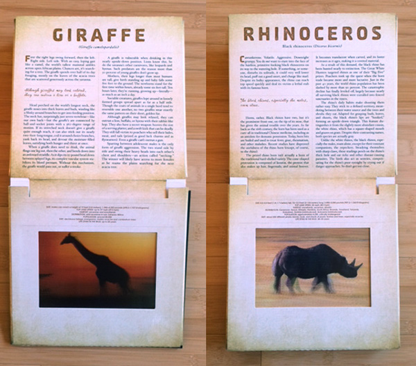
Safari is a book that operates on so many levels and serves so many curiosities. Your first pick-up of the book takes you into its magic — the photicular images of eight African animals running or doing their thing (designed and photographed by Dan Kainen). It’s a total experience for the reader as you control their speed by how fast you turn the previous page. This is a mechanical marvel that uses an old technology called lenticular photography but presents it in a brand new way. This was popularized with the book Gallop but brought to a whole new level in Safari. You can literally spend hours turning the pages and imagine yourself on safari watching these majestic creatures at close range. This alone makes this a book suited for kids as well as adults.
The second level is the story of the safari written by Carol Kaufmann describing her guided trip to the northwest corner of Masai Mara, Kenya. Carol vividly chronicles her days, the landscape, and the numerous sightings and encounters. She records much of the dialogue with Massek, her guide and others which helps put you in the seat next to her in the Range Rover. And it is a wild ride. There is no mistaking; she is borrowing a rare glimpse into this majestic and dangerous world.
The third level is the description of each of the eight animals photographed. Written with the same voice as her essay, she delivers myriad facts and specs with warmth, humor and empathy. For example, a rhinoceros is described as cantankerous, volatile, aggressive—and downright grumpy! Beneath her storytelling is one more level of info—a list of facts and figures if you considered stowing one of these beasts on your carry-on.
This is an amazing and marvelous book—in content, design and execution. You would expect it to be sixty bucks, but it’s not even close! It belongs on every kid’s top shelf and parent’s coffee table.

Tyler Makes Spaghetti!
Written by Tyler Florence | Illustrated by Craig Frazier | Harper Collins 2013

Tyler Makes Spaghetti! Is my second book (first posted April 2012) with the talented Chef Tyler Florence. Keeping with our theme of teaching kids where food comes from, little Tyler takes on his favorite dinner dish—spaghetti and meatballs. The recipe takes Tyler and his dog Tofu on an imaginary trip to find the likes of basil, olive oil, tomatoes, Parmigiano-Reggiano, and stinky garlic and onions. He also gets a hands-on lesson from Chef Lorenzo on rolling out fresh pasta. At every turn, chubby Tofu finds mischief and disorder and ultimately makes a disaster of the meatballs. Tyler’s spaghetti dinner eventually meets the approval of Chef Lorenzo and he is rewarded with a chef’s coat of his own. Food Network here he comes! The book finishes with big Tyler’s recipe and a page of ‘did you know’ facts about the ingredients.

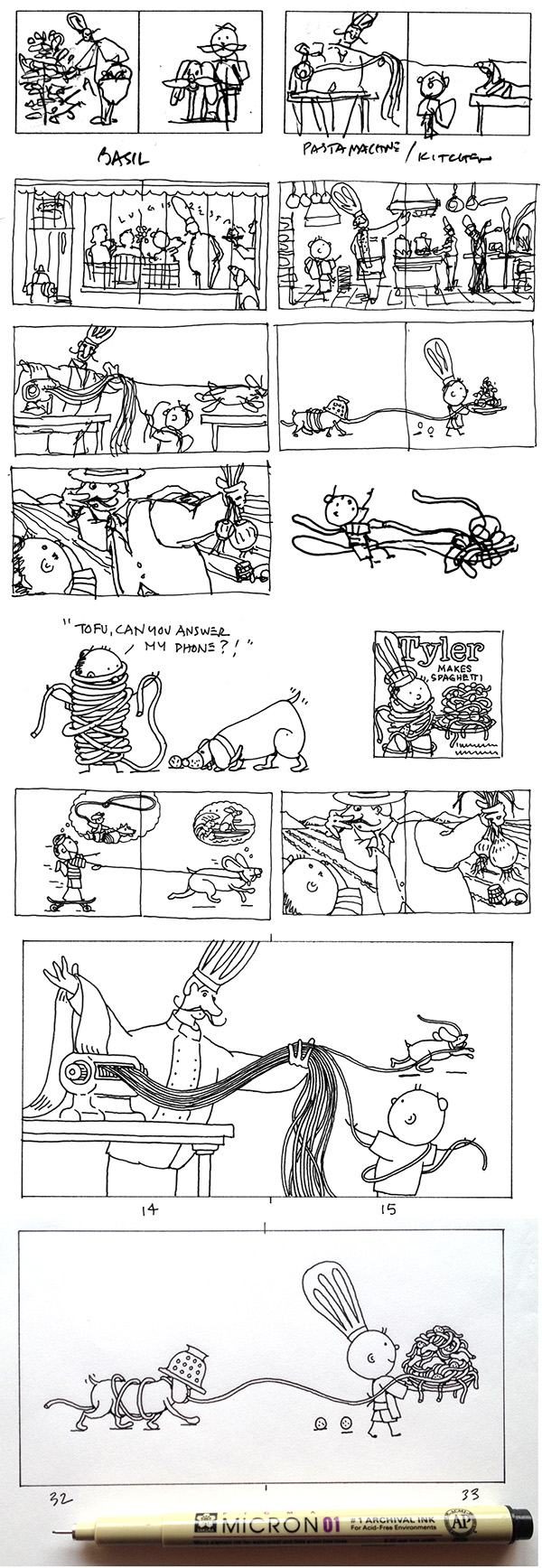
The illustrations are designed to look very simple (including Tyler’s big orb head), but I only get there by drawing and redrawing my sketches. I start with loose pencil sketches with notes, often drawn with Tyler as we develop the story line. I’m looking for elements and compositions that tell the story with the most interest and simplicity. The challenge is to keep changing the scale and point-of-view with each new scene. Tofu offers comic relief and a sense of energy to each spread. I work very small as it forces the editing process and limits the detail. It is also fairly fast to develop an idea. I do a fairly tight version of each page and build a storyboard for Tyler to write to and to discuss with our editor. Eventually, I draw each illustration to the identical scale (small) with a brand new Micron 01 pen on marker paper. The rest is a coloring exercise in Photoshop. I design and lay out the final book for printing in InDesign. Tada!
Henri’s Walk to Paris
Written by Leonore Klein and illustrated by Saul Bass | Universe Publishing 2012 | Originally Young Scott Books 1962

In 1962, if you illustrated a children’s book, and was Saul Bass, you designed it as well unlike any other children’s book at the time—or today. At fifty years old, Henri’s Walk to Paris may be one of the freshest picture books you can pick up today. This is a charming story about a boy that wants to leave his little town of Reboul and walk to Paris where things are really happening. He is tricked by his own plan and learns that ‘there is no place like home.’ As they say, this book has got story—but what it really has is design with a capital D. One of the most famous and arguably—best designers in the past century—Saul Bass had a command of form and symbol in corporate trademark design and his dozens of movie posters. Logos like United Airlines, The Girl Scouts and AT&T are embedded in our public minds and are the gold standard for designers looking to distinguish a client’s identity. His movie poster illustrations were just as bold and graphic but typically rendered with cut paper giving their voice a human touch.
This book is rendered the same way with the occasional graphite line added. He employs a bright and vivid color palette, almost tropical in its use of pinks, turquoise and lime green. Perhaps the most striking facet of this book is its page layout and use of type. Saul treated each page and spread like a poster. The most minimal of detail and often only a partial figure were used to tell the story. His sense of scale and restraint are monumental—he simply leaves so much more for the viewer to complete. He starts the story and you complete it. This is missing in most books today that don’t give kids and parents the credit to imagine—nor encourage it. The typography is always positioned in a compositional way leading your eye through the book like a map. In several cases the words actually become the figure adorned with a hat and shoes. The cover is a remarkable melding of type and image and defies any marketing argument that big is better. The feet almost walk off the page! This book is on my top shelf!
The Sea
Marianne Dubuc | LO Editions 2012 | 64 pages

The Sea is a book for seeing. Marianne Dubuc has created a minimal book completely devoid of words and illustrated sparingly in two colors. It is a ‘journey’ book as we follow a determined feline in pursuit of a tireless flying fish. But this book is really about looking closely at the illustrations and making your own story. With 64 pages of patient and whimsically detailed graphite drawings, what’s not to like? There are jelly bean clouds, round house windows, a cat with a long nose, and of course a fish with popsicle stick-like wings. Marianne’s depiction of entering and existing space is priceless. This is a refreshingly different kind of book—very Italian and very lovely.


