Archive for June, 2012
Judging a cover by its book.
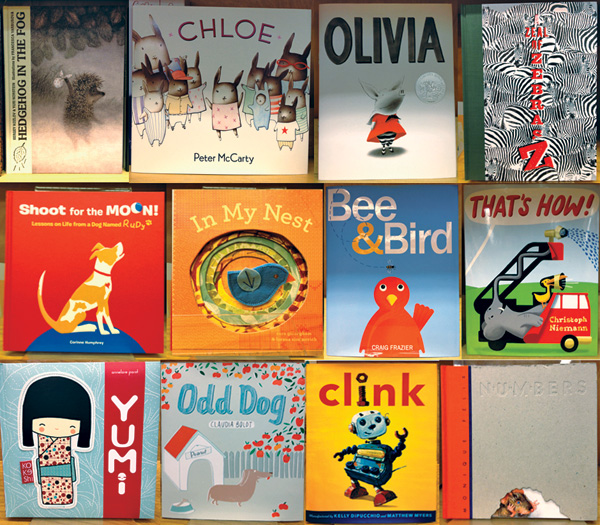
I stopped by my favorite local bookstore, the Depot, and thought I would quiz my own sense of design on the spot by picking the covers that I felt were exemplary. Within a few minutes, I identified several covers that immediately attracted my attention. I have created a list of criteria that may serve to explain why I these covers rise above the crowd. My thanks to the Depot for letting me mess up their tidy shelves.
1. simple
2. short title
3. central figure/image
4. use of scale between type & illustration
5. graphic intrigue/ conceptual
6. bold use of color
7. cute
8. long distance read

Hedgehog in the Fog 1, 3, 7
Chloe 1, 2, 7, 8
Olivia 1, 2, 3, 4, 6, 7, 8
A Zeal of Zebras 1, 5, 6
Shoot for the Moon 1, 3, 6, 7, 8
In My Nest 1, 2, 3, 5, 7
Bee & Bird 1, 2, 3, 4, 6, 7, 8
That’s How! 2, 5, 6, 7
Yumi 1, 2, 3, 6, 7, 8
Odd Dog 1, 2, 4, 6, 7
Clink 1, 2, 3, 4, 5, 6, 7, 8
Numbers 1, 2, 3, 5, 7


