Archive for January, 2011
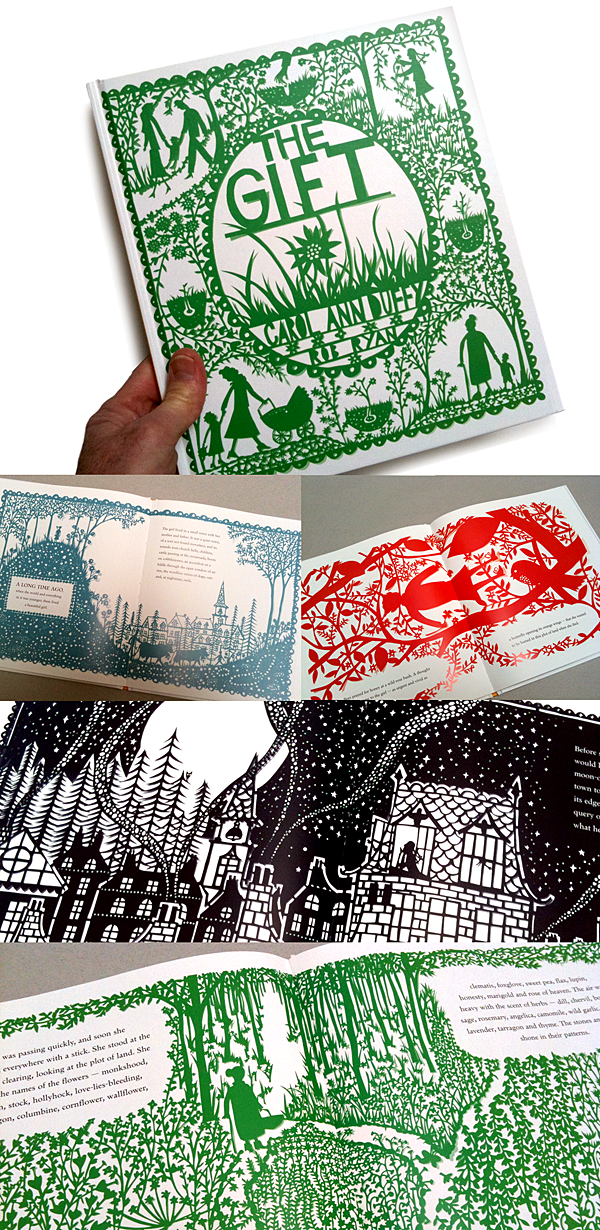
The Gift
Rob Ryan | Carol Ann Duffy | Barefoot Books 2010

I like to cut paper as much as the next illustrator, but the work of Rob Ryan in The Gift is insane! In the spirit of Victorian silhouettes, Chinese cut paper, and Mexican folk art (papel picado), Rob’s work is all about creating intricate scenes—in one color. The Gift is cover-to-cover single or double-page images of meticulously cut renditions of flora, fauna, landscapes, quaint towns, and the story’s protagonist and extended family. Written by Carol Ann Duffy, the story is a lovely circle-of-life tale that takes a little girl from youth to the ground. Though a delicate subject for a kid’s book—with the help of Rob’s enchanted illustrations—never becomes a downer.
Each illustration is a masterful demo in scale, composition, line and form, positive and negative, pattern and texture—and crazy detail. The design of each single-color illustration accounts for the perfectly nestled typography of Carol Ann’s vivid prose—a dance not often done well in kid’s books. This book could have been made 40 years ago or 40 years from now. A gift it is.
Mad at Mommy
Komako Sakai | Arthur A. Levine Books/ 2010

There’s nothing quite like an angry rabbit. There’s also nothing harder to illustrate than all the emotions that a kid, (or bunny) has when he is mad at this mom. Komako Sakai has written and illustrated a book that tells the universal story of a kid’s frustration with his mom, or dad—and the ultimate threat to leave home for a better life. Having cast bunnies in the roles, this book is far more fun and accessible than would be with humans. Komako has captured pouting, ignoring, demanding, whining, disbelieving and just plain ticked off with masterful paintings using a subtle palette and confident brushstrokes. With two little eyes, a spot for a nose, an inverted ‘Y’ for a mouth, and two expressive ears—you get all the info you need to empathize with this little child/mammal. Mad at Mommy is as artful and attractive as it is sweet and sincere. It’s bound to give any parent pause to think about those sulky looks from their kid.
Not a Sick Day today!
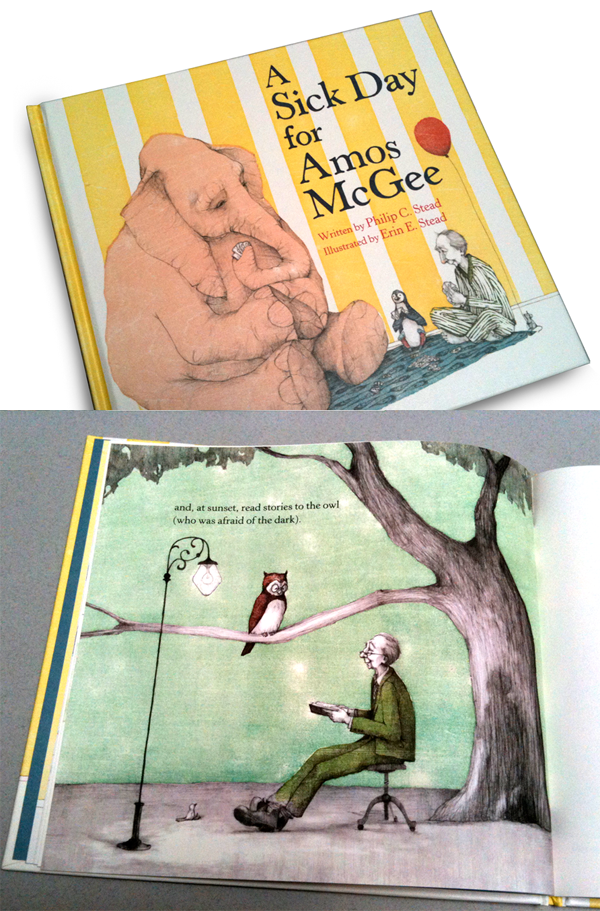
A Sick Day for Amos McGee
Written by Philip C. Stead & illustrated by Erin E. Stead | Roaring Brook 2010

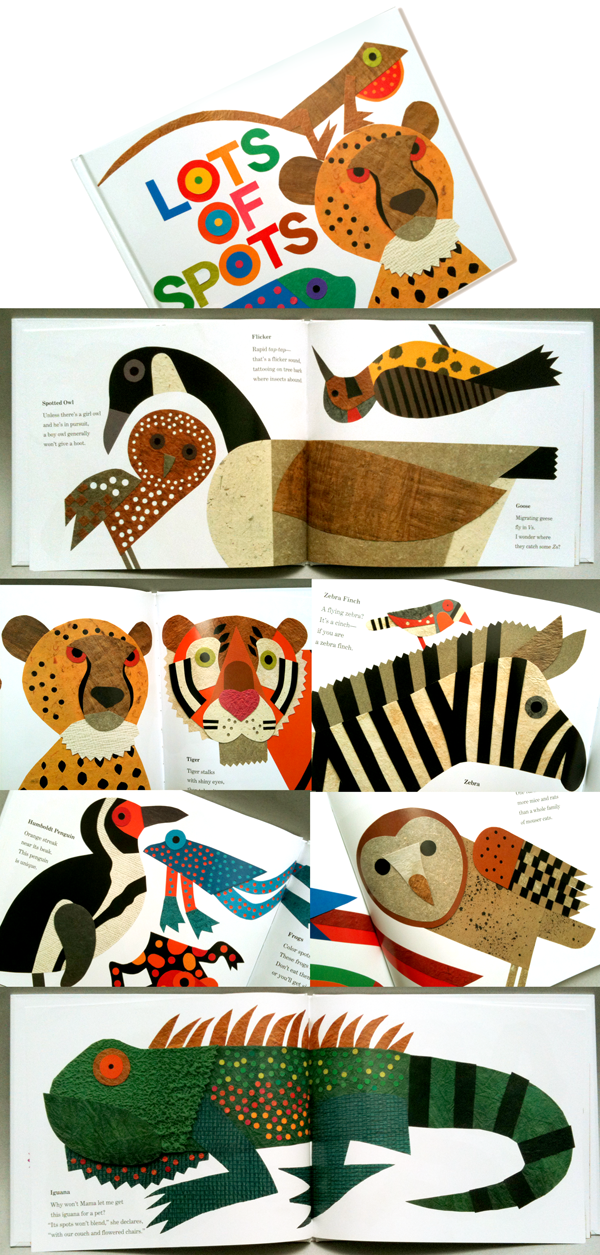
Lots of Spots
Lois Ehlert | Beach Lane Books 2010

I just published Lots of Dots this fall, so you can imagine my surprise when I stumbled upon a book called Lots of Spots a few months ago! Before I could get the least bit bothered I saw who did it and immediately tore into the pages. Like mine, it’s a seek and find book about all the places spots appear—in this case—specifically on animals. My immediate reaction was the realization that there was room in the bookstore for both our books and I’d be proud to be near this one.
Lois Ehlert has been cutting out and collaging her illustrated kid’s for around 20 years that I can tell. She has been pretty focused on animals as subjects so it’s no surprise that she is very good at representing all things wild. Lots of Spots features no less than 62 creatures of the wild—all with some degree of spots to their appearance. A few actually have stripes but that’s okay given the sheer volume of spotted beasts she has included. I am very familiar with Lois’ work but this book has some of her looser, even more confident illustrations. All of them have a beautiful sense of design with nods to Leo Lionni, Eric Carle and Henri Matisse, but she has her own sense of style and technique. Though very geometric, they all appear to be cut free of straight edges and perfectly scribed circles. Her smaller dots do appear to be punched out with a whole punch, (who can blame her.) What is so powerful about this book is the striking compositions of each spread—an owl nested under the neck of a goose, or a roadrunner running down the tail of a pheasant, or the cheetah and tiger side-by-side staring the reader down. Each animal captioned with a short rhyming factoid about its existence in the world.
What strikes me most about this discovery book is the incredible palette of colors and textures Lois employs in each illustration. Her cut-paper illustrations sit on the white pages and make you want to touch and feel the grain and weave of each piece of paper—some simple craft or PMS paper—others exotic handmade pulps. Her rendition of every nuance of each animal is heightened with color and elegant graphic form. Her sense of design is informed by a deft examination of what makes each of these animals so unique and wonderful. Lots of Spots is on my shelf—right next to Lots of Dots!


