Archive for July, 2010
Paul’s Touch
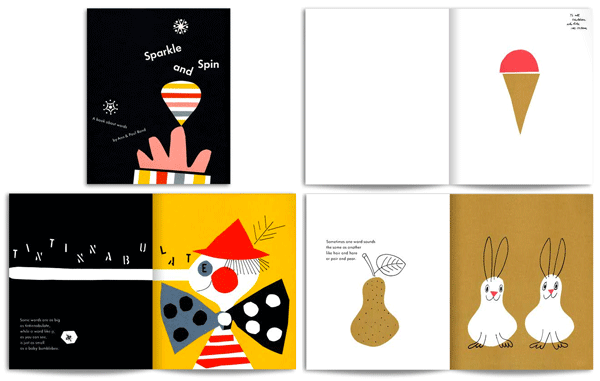
Sparkle and Spin’s dedication reads, “ To all children that like ice cream,” accompanied by a brown triangle topped with a pink semicircle. Such is the brilliance of this book originally published in 1957 and recently re-released in 2007 (Chronicle Books). It is written by Ann Rand and illustrated by design icon Paul Rand—best known for his corporate work such as the IBM logo and original UPS logo. The illustrations are extraordinarily playful—almost as if cut from paper by a child—and are paired with rhythmic words that are just as playful to read aloud.
Originally published in 1962, Little One is another example of Rand’s visual wit. This is a story of a lonely number 1 in search of being something more than a single digit. Page after page of rejection from bigger numbers, he eventually finds himself standing next to a zero—together making 10! The story goes that Rand designed these books in one sitting each, not unlike the genius of a child!
If you didn’t know, you would think that Paul developed a unique ‘childlike’ style that he employed in his kid’s book designs. The truth is that Paul Rand—the master of corporate identity and design as we know it today—employed the same touch that he used in his day job as a designer for corporations like IBM, UPS, Westinghouse and Olivetti. Just goes to show that wit and simplicity are universal and know no age.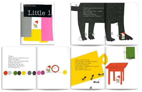
Casey At The Bat
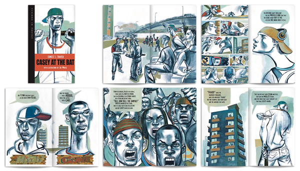
Written by Ernest L. Thayer, Illustrated by Joe Morse | Kids Can Press 2006
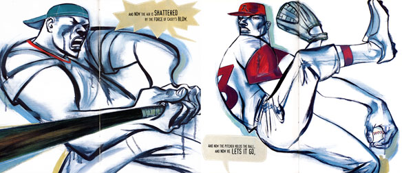
Casey at the Bat is a very contemporary interpretation of the classic Ernest L. Thayer poem originally published in 1888. Illustrator Joe Morse sets the poem on gritty urban streets with a multiracial cast of characters with the prose housed in comic-like speech bubbles. Joe brings the style of his visceral oil paintings, (frequently seen in the pages of Rolling Stone magazine) to play out the story of a proud and mighty slugger. He powerfully captures the tension of the fans, ump, and the players—and takes you on an exciting ride all the way to the ultimate ‘strike 3’. You can almost smell the hot dogs!
Little Pea

Written by Amy Krouse Rosenthal, Illustrated by Jen Corace | Chronicle Books 2005
There is only one word for Little Pea—cute! Like so many books whose main characters are animals that assume human behaviors (anthropomorphism), this one is none other than a little green pea. Maybe chosen because it’s one of the more rejected foods at the dinner table, this pea has a dinner problem too. Forced to eat dreaded candy, in large quantities, he is tempted with the classic lure of “dessert only if you finish your dinner.” It’s a wonderful turn of the table as spinach is the pea’s favorite dessert!
Jabberwocky
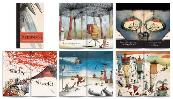
Written by Lewis Carroll & Meredith Brucker, Illustrated by Stéphane Jorisch | Kids Can Press 2004
Often considered to be the greatest nonsense poem written in the English language, Jabberwocky was written by Lewis Carroll and originally featured as a part of his novel Through the Looking-Glass, and What Alice Found There in 1871. In Jabberwocky, Carroll created an altered sense of meaning through the coining of new words, called portmanteau words. A portmanteau is, of course, a large suitcase, and as Humpty Dumpty explains to Alice in Through the Looking-Glass, a portmanteau word is “two meanings packed into one word.” Like, “chortle,” which is the combination of “chuckle” and “snort.”
This 2004 version, illustrated by Stéphane Jorisch, is testament that nonsense never goes out of style, and in fact, makes as much sense (or non) as it did over a century ago. Jorisch creates a fantastic modern-day nonsensical world of his own with her muted pen-and-ink watercolors. The introduction of televisions and spy cameras lend a certain spooky and military element to the story—not to mention that the actual slaying of the Jabberwock is fairly graphic. His characters are both dark and humorous and all masterfully drawn. The design of this tall, slender book contributes greatly to its excellence. Each page is composed with its own dramatic scale and unique point-of-view—complimented with playfully energized typography. The words are absolutely alive on every page. This is a book that will last a lifetime on a child’s shelf to be revisited time and time again as age changes their perceptions. Parents will find new pleasure and meaning in indulging in a little more nonsense.
The Race
Written by Caroline Repchuk, Illustrated by Alison Jay | Chronicle Books 2001
It’s risky retelling an old story, particularly an Aesop Fable. However, the words of Caroline Repchuk and the illustrations of Alison Jay take on the challenge with sublime confidence. They have recast The Tortoise and the Hare into an around the world race to the finish from Europe to New York. The Race is a delightful, if not a zoological and geographical splendor to page through. As in the original, the hare encounters numerous conflicts and near-disastrous experiences due to his haste, while the tortoise leisurely enjoys a journey complete with fine dining, relaxation—and certainly no anxiety. The dominant story revolves around the hare’s exploits such as rear-ending a poodle while speeding in Paris, or nearly losing his lunch while on a Panda-skippered boat in China. Alison Jay’s distinctive crackle-glazed paintings offer hours of study in the details of the many animals and bugs that populate their landscapes. The story ends pretty much as you expect, but the journey is not short on surprises.


