Posts Tagged ‘animals’
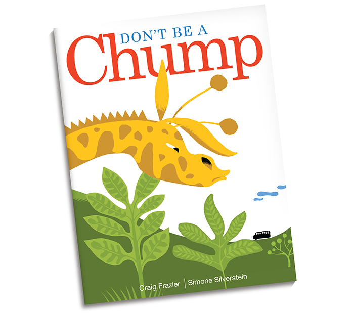
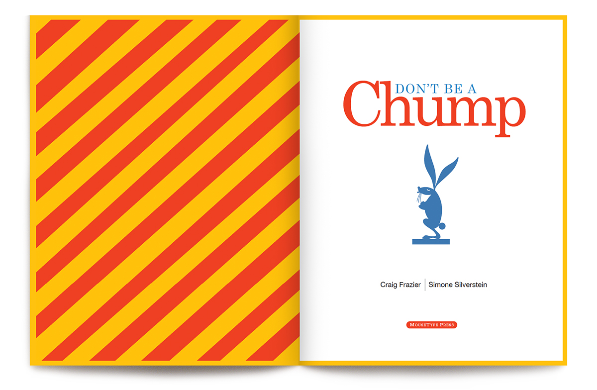
Don’t Be a Chump
Craig Frazier & Simone Silverstein | 36 pages | MouseType Press (self-published) | ebook
Partial book only shown below/ Buy ebook
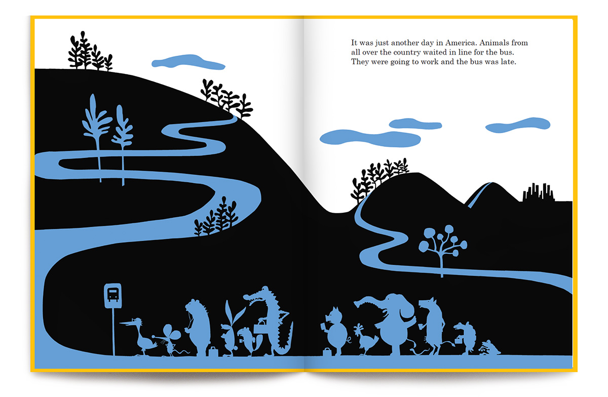
Don’t Be a Chump looks at our current times in this country and the threat of one of our Presidential candidate’s hateful rhetoric. Bullying, lying and disparaging others is the behavior of a chump and is unacceptable, under any circumstances, for any age. However bad, this is a teachable moment for kids and parents. Though loosely fashioned around our election, the message of this book will live on long after.
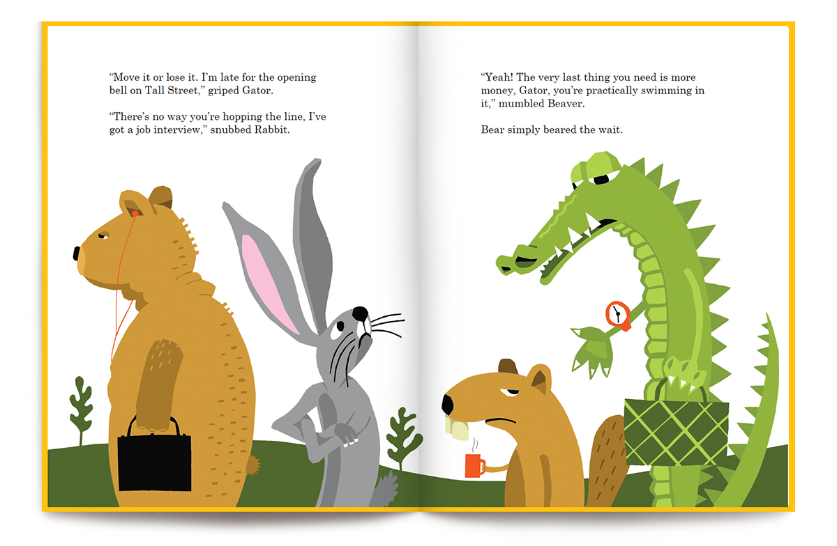
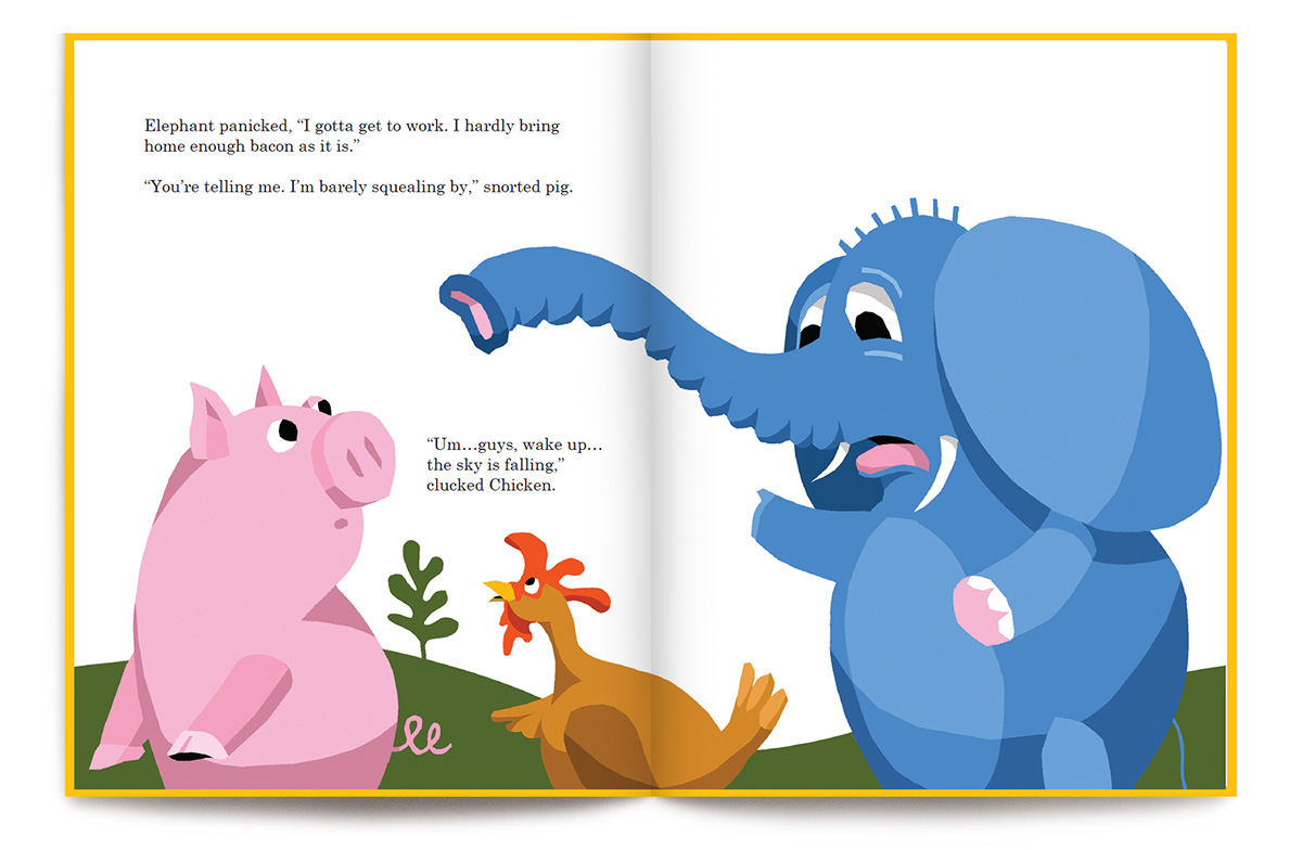
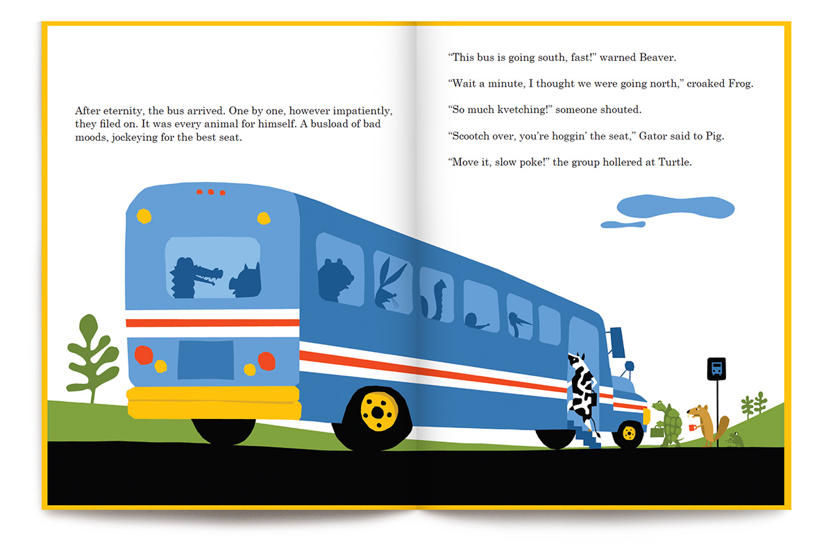
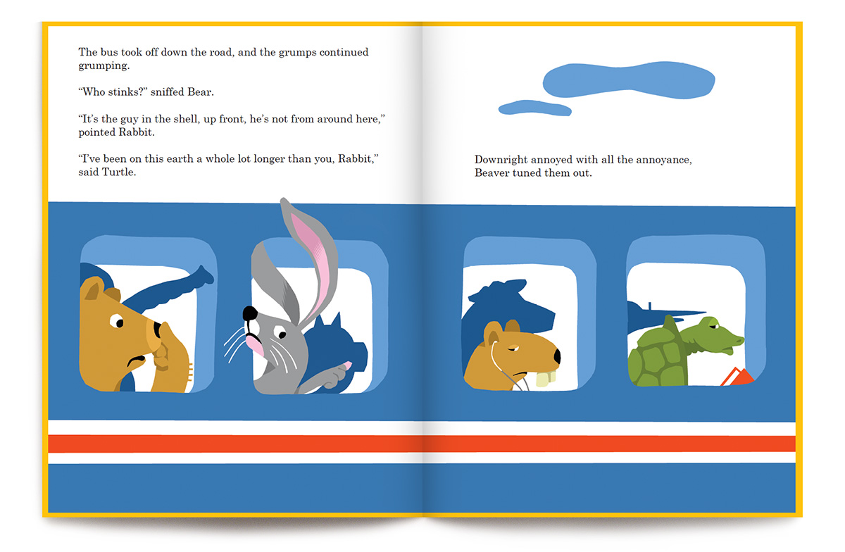
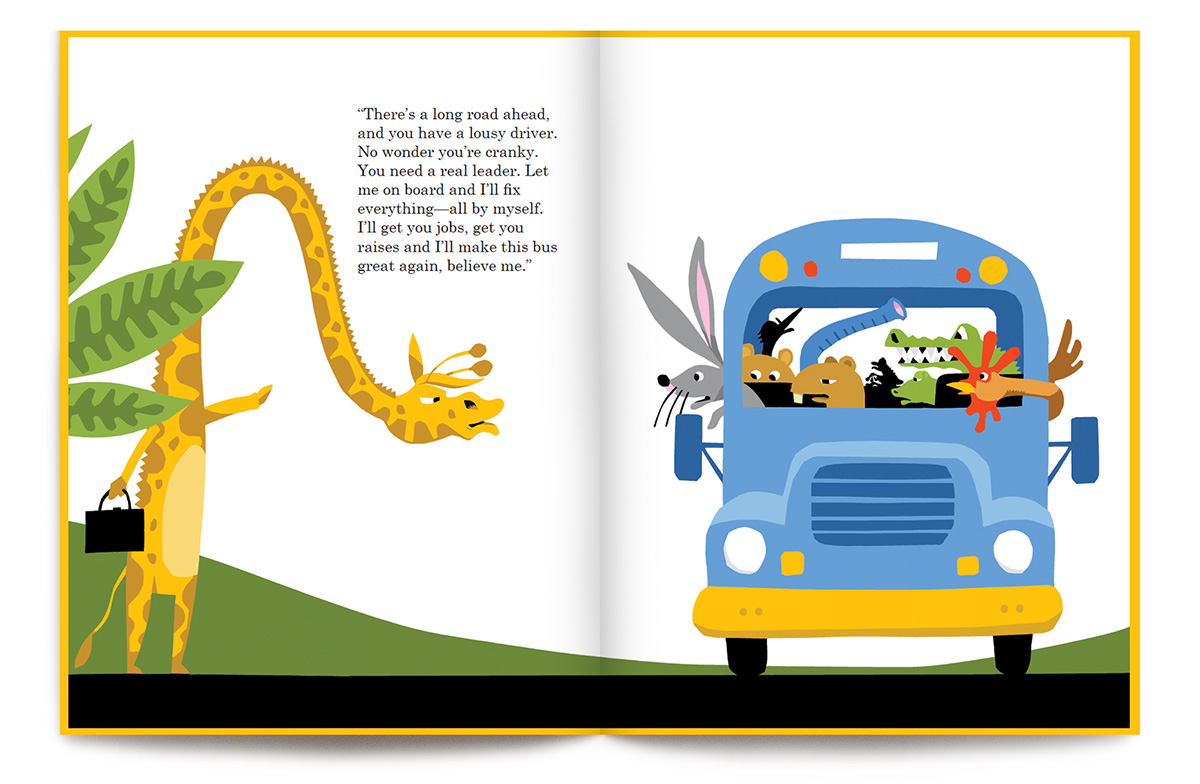
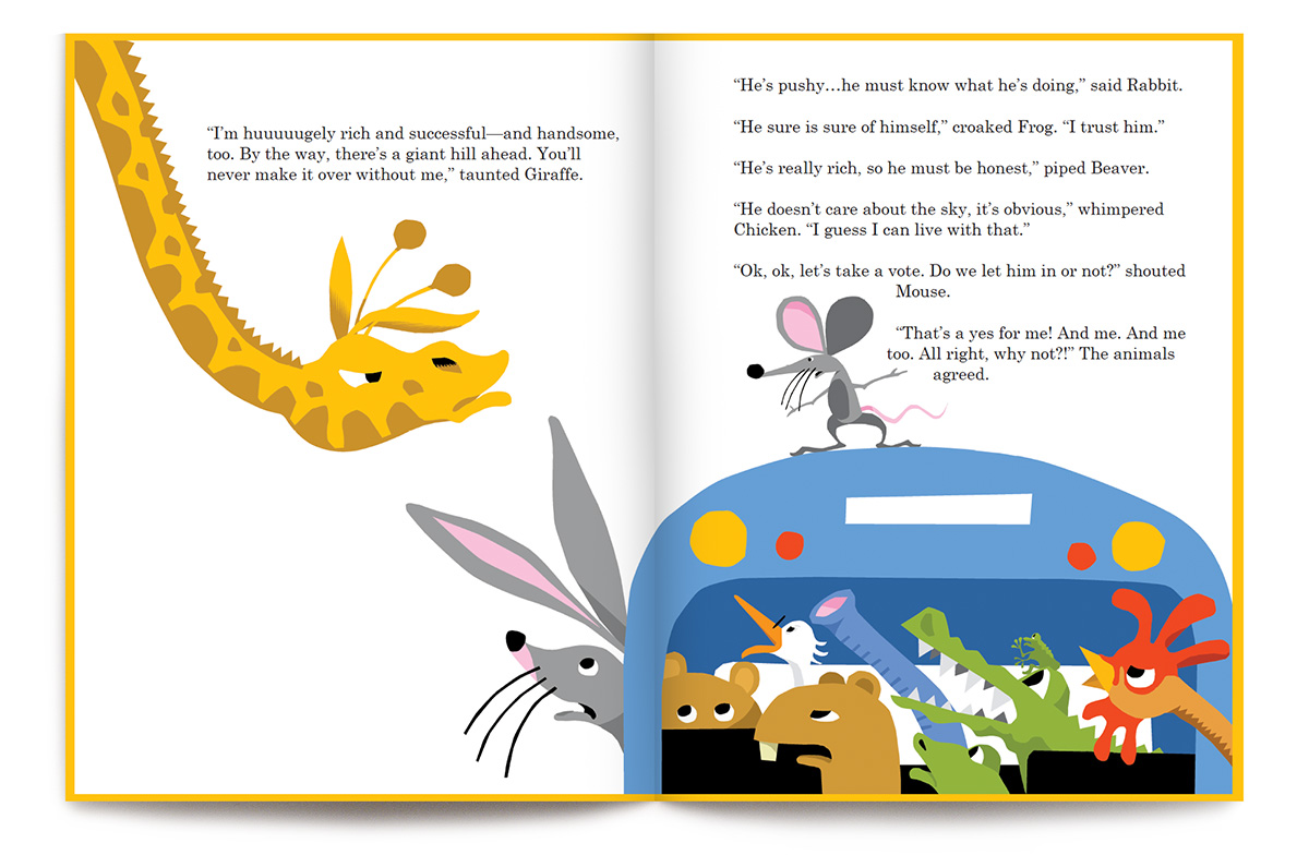
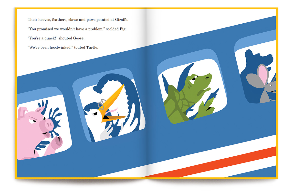
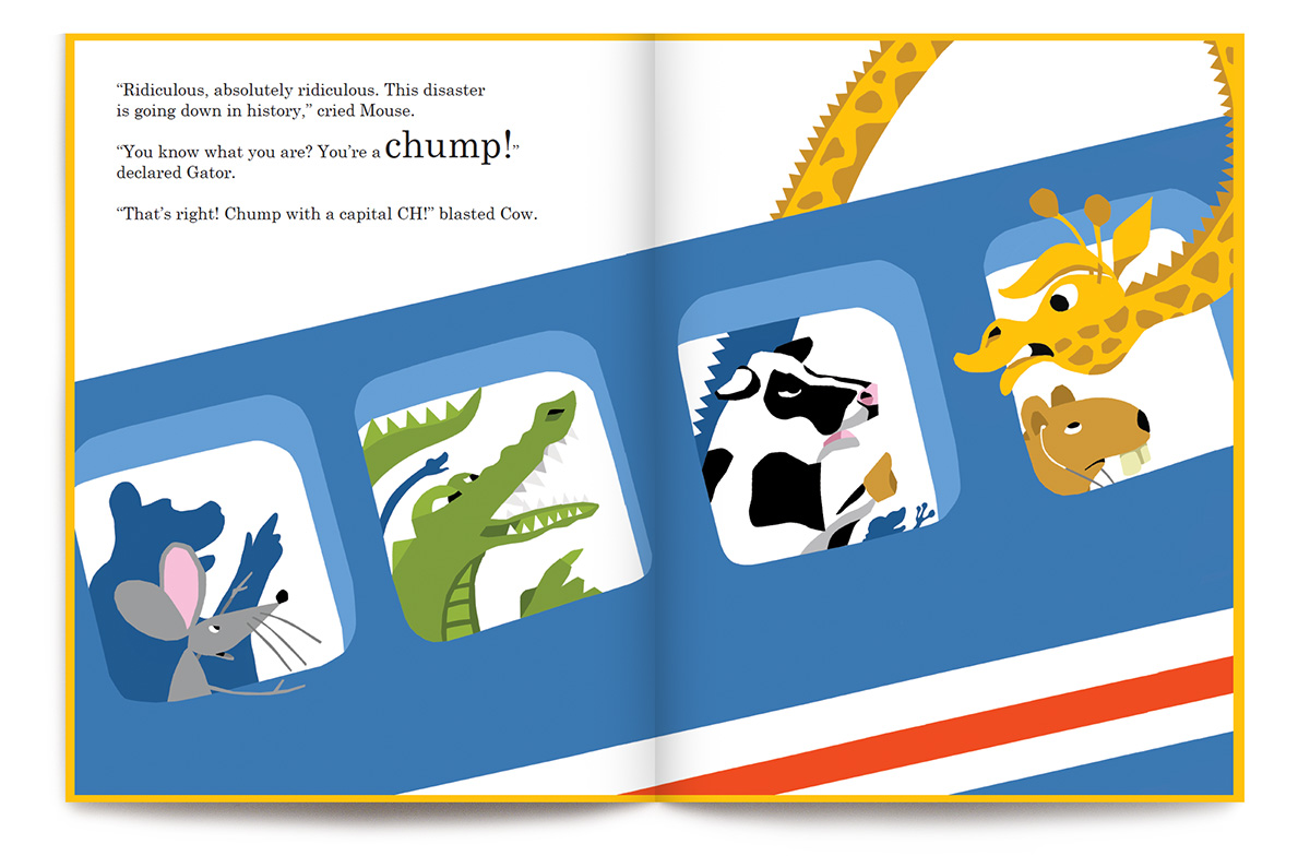
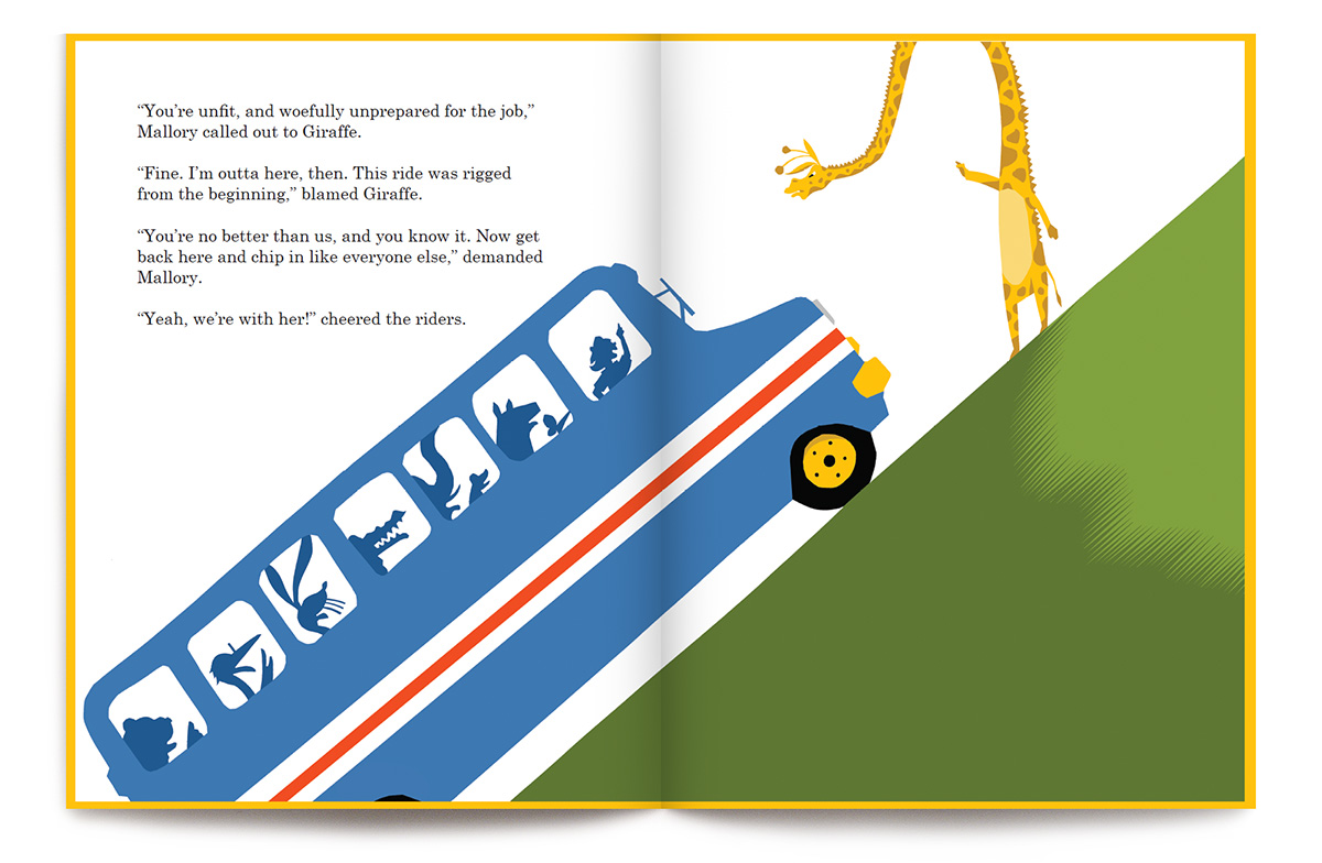
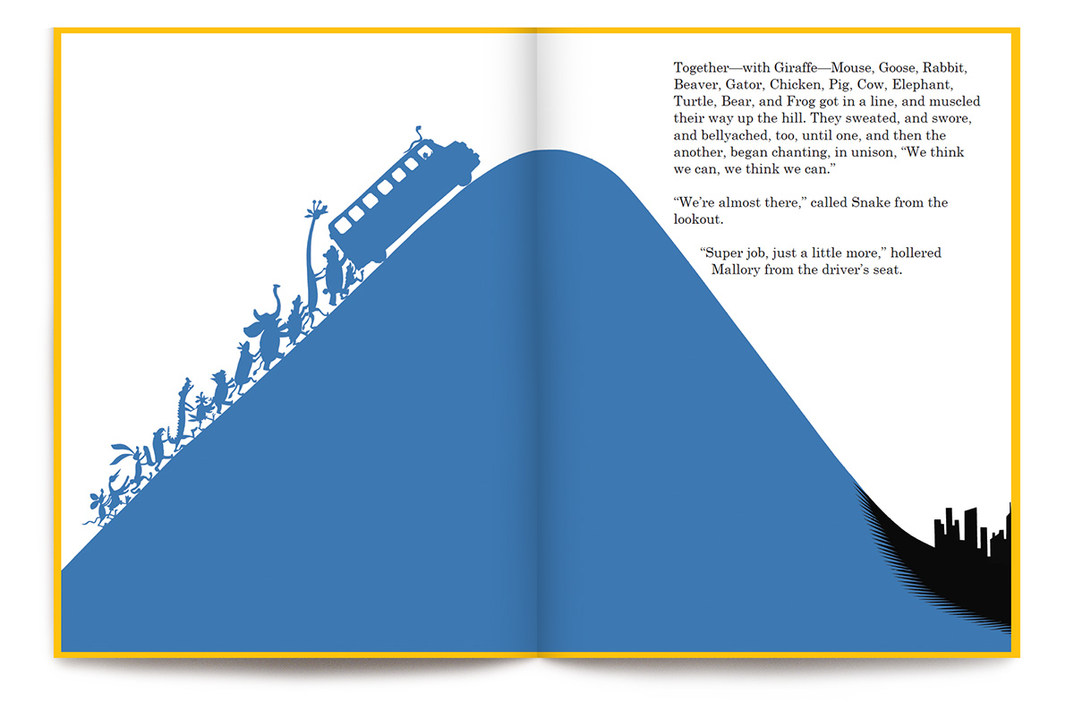
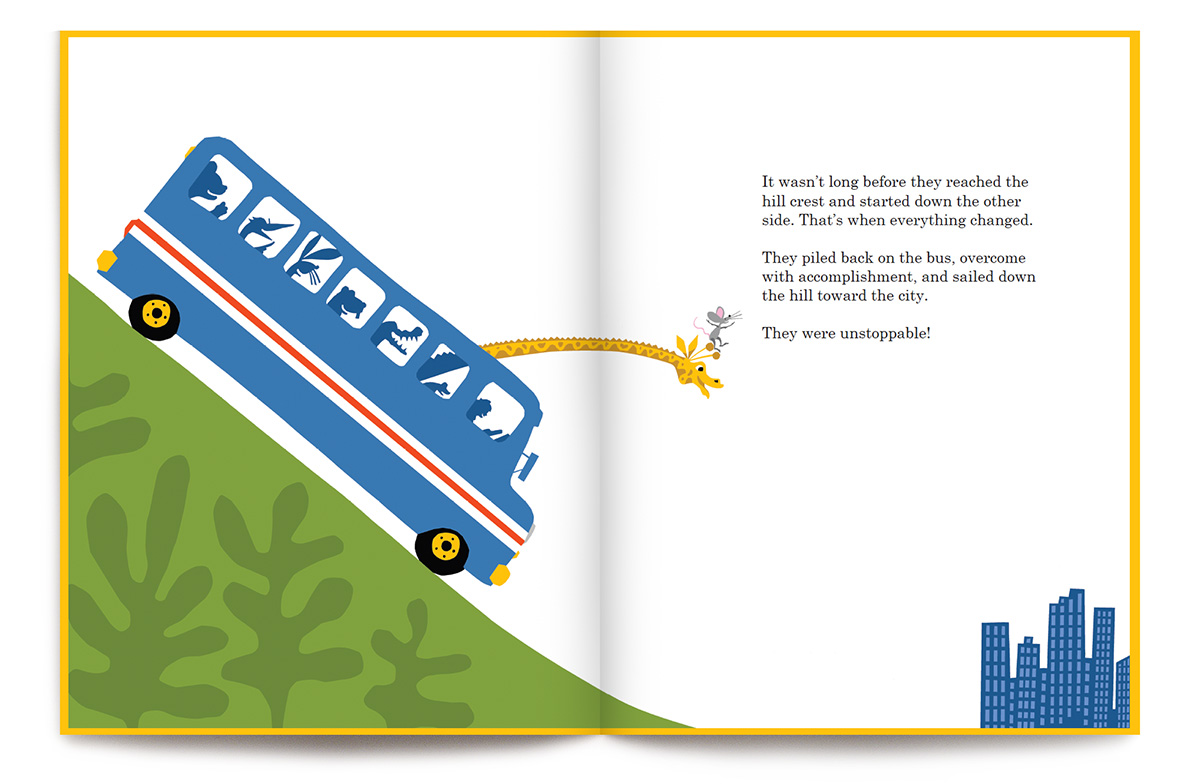
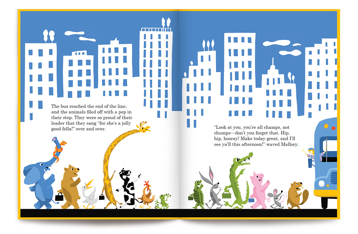
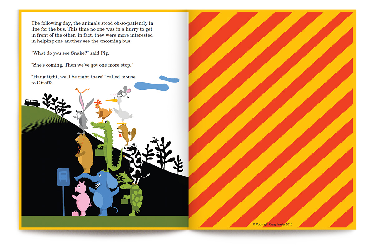
Disgruntled animals line up to get on the bus, each starting their day with frets and complaints. They come on to the lone Giraffe who bullies his way onto the full bus with his braggadocios remarks and the claim that he can “make this bus great again.” When the bus stalls and all mayhem breaks out, bus driver Mallory calms the passengers and lets them know they are starting to behave like the Giraffe (chump). She encourages their team participation in solving the problem. Together—with Giraffe—they push the bus over the hill. The animals refuse to be bullied and learn that no one is alone and cooperation and collaboration triumphs over anger and bullying.
This book is available as an ebook for download at Amazon.
Click on thumbnails to preview entire book.


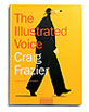
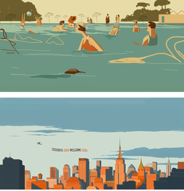
The Journey of the Penguin
Emiliano Ponzi | Penguin Books 2015 | 96 pages
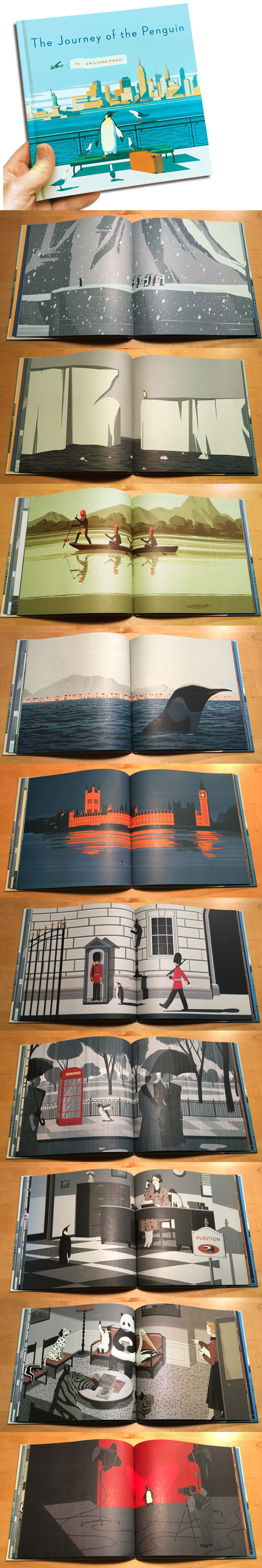
This is one of those picture books that will reset the bar for ‘epic’ projects. Renowned Italian illustrator Emiliano Ponzi has filled the pages of The Journey of the Penguin with over ninety extraordinary illustrations. Every single one is designed and presents a grand cinematic point of view. As a ‘wordless’ book, the weight of telling this charming tale of the penguin’s journey rests entirely on his illustrations. Ponzi is masterful at describing location, action, tension and most importantly creating empathy for his star character. He doesn’t make the mistake of ‘over-telling’ the story because of the absence of words. In fact, he sparingly drops breadcrumb clues that lead you through the picturesque trek. Ponzi’s sense of restraint is the key to this book’s success—as you solve each page’s riddle—you assume authorship of the tale.
Ponzi’s attention to detail and nuance is unrelenting. From the flower details on the receptionist’s dress to the New Yorker cover to the twin lights in the current day New York skyline. These jewels all make this book worthy of countless ‘reads’ by audiences both young and old.
Ponzi was generous enough to field a few questions about his own journey making this book. He has also agreed to share some of his sketches as well. Thank you Emiliano!
cf Tell us how the book came about. Did you develop the story about the penguin then propose it to Penguin Books in time for their 80th anniversary?
ep I came up with the idea to tell the chronicle of a penguin from Antarctica who travelled to London to attend an audition for a newborn publishing house during the 30’s. I sketched a couple of drafts directly with colors the day before I to fly to NYC to receive an award. I set up a meeting with the Penguin Books Executive Creative Director, Paul Buckley. Two hours after our chat I got an email from Paul telling me he had spoken with the executive editor Patrick Nolan and they were both excited about my idea. They asked me to see the whole layout to understand what to do with the book—where to put it in bookstores. The book was not completely specifically for adults or children. So over one weekend I sketched all the pages from the first to the last one building the story—particularly the emotional and crucial nodes of the narration. That was a sort of magic-inspiring moment—to be that focused has happened just two or three times in my professional experience. I sent everything to Penguin; they came up with the idea to publish it as one of their 5 books for the Publishing House’s 80th anniversary. My editor Chris Russell helped me to adjust some parts of the narration to make it more fluid. We figured out how to add the final section of the book that talks about Penguin USA in the present day. That wasn’t in the original storyboard.
cf Wordless books are rare as picture books—was this book always conceived without words?
ep I didn’t really conceive it as a picture book but more as “I did this and what you think about it? How we could eventually improve it.”
Now that you are making me think about it, I don’t remember it as an item we really discussed—like no one really pointed out that the book hasn’t a written text. That’s funny.
Words looked useless to me as the narration could be followed looking at pictures and clues scattered around the pages. The power of a silent book—and its lack of words—is the possibility for the reader to project their own thoughts and sensations. You have more freedom to interpret it based also on the person you are. I found this void more interactive.
cf What was your process for developing the narrative?
ep The first time I showed the sketches to Penguin (before designing the whole book), they were accompanied with a synopsis and more narrative options. One included the possibility to show the bird with many Penguin authors as a sort of writer’s catalogue.
cf The book is about five times longer than a normal picture book! How did you determine its length?
ep I guess I had a lot to show and tell! Plus, the people I submitted the project to are in the adult section so we didn’t pay much attention to the (children’s books) standards in this sense. Eventually we needed to add pages at the end to get to a certain count.
cf What kind of research did you do for both the penguin and the locations?
ep I did much research on more than one layer:
The content/story.
The structure was based on Vladimir Propp scheme that can be found in his 1928 book “Morphology of a folktale”: showing an initial balance, the breaking of the balance caused by an external event, the journey of the hero and the final creation of a new balance. I started illustrating when I was 19 and didn’t really study it before then. I had never colored an image because my background was mostly focused on pedagogy and psychology.
The content/aesthetics, the temperature.
I usually create a mood boards similar to the one used for the fashion season collections that helps me very much to understand the general environment, the use of colors, and the details too.
The character and the composition.
I studied the penguin bird design in a way so that I didn’t make it too childish (no exaggerated facial expressions for example). In part I wanted it to be a sort of realistic penguin and on the other side I needed it because at a certain point it was suppose to become the company logo so couldn’t really be too different.
cf How long did it take to create the book? Was it difficult to pace with your regular workload?
ep It took a weekend for the 90% of the sketches and a couple of weeks for the cover. That was a tough item to design because it needed to contain important elements of the story without telling too much of it. It also needed to be attractive, to pop up from the bookshelves.
It took around two months to color everything and there was no other option because we had to send it to print. Somewhere along the process I completely redesigned some pages because I wasn’t sure about the composition or the effectiveness in term of narration. For those two months I had to turn down all the other assignments, there wasn’t another way to accomplish the project. I had little time and I wanted to dig in the mood of the book without being distracted by other illustrations that might have taken my attention in another direction. In a way it was like living in a cloister.
cf Each spread has very particular color choices. Can you talk about your process for coloring these, particularly creating those small color ‘moments’ in many of the illustrations?
ep I kept a very muted tone in the Antarctica/London part of the story because it takes place in the 30’s. I wanted to depict a sort of ‘vintage’ atmosphere as we all have the perception that the past is imagined in black and white. I decided that in those environments some elements had to stand out to give more vibrancy to the page.
cf How involved was your editor in the process and what was that like?
ep I have to say that all people I worked with were amazing and nice to me—Paul Buckley, Patrick Nolan and Chris Russell, who was my editor. He helped me very much with the narration especially with the second part (in New York) as we created it to depict Penguin Books in the present days.
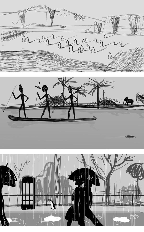
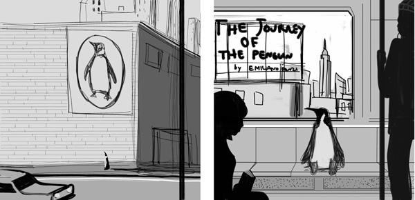
cf Can you describe your process of making an illustration from start to finish? Can you show us some developmental sketches?
ep As I said I sketched the whole book in a weekend. It was June 2013. I started working on the finals around April 2015 so a lot of time passed in between. Many solutions needed to be revised and in a ‘cold thinking’ some sketches had to be improved. I first approached those drafts I loved most so it would be easier to start the fight with the massive amount of illustrations I had to accomplish. I filled the blank page with a color, grey-blue or grey-red, and then I kept adding elements and coloring until I was super happy about the result. My main goal was a sense of coherence and the creation of sophisticated color pairings. I drew every image at least twice. Sometimes I made five or six versions of the same final in order to find the right solution before eventually dropping them in.
cf How does it feel to have accomplished such a mammoth undertaking (so beautifully)?
ep I feel I did my best with this project, as soon as I finished It looked perfect to me, then of course I saw some details or solutions that could be done in a different way. Experimenting with perfection means feeling our limits—as we couldn’t do more than that in that moment.
I’m really happy because I feel I did my best, the other side is the audience. I hope they enjoy the book and can see something interesting filling the void of words with their own thoughts.
Waterlife
Rambharos Jha | Tara Books 2012 | Limited Edition | 28 pages
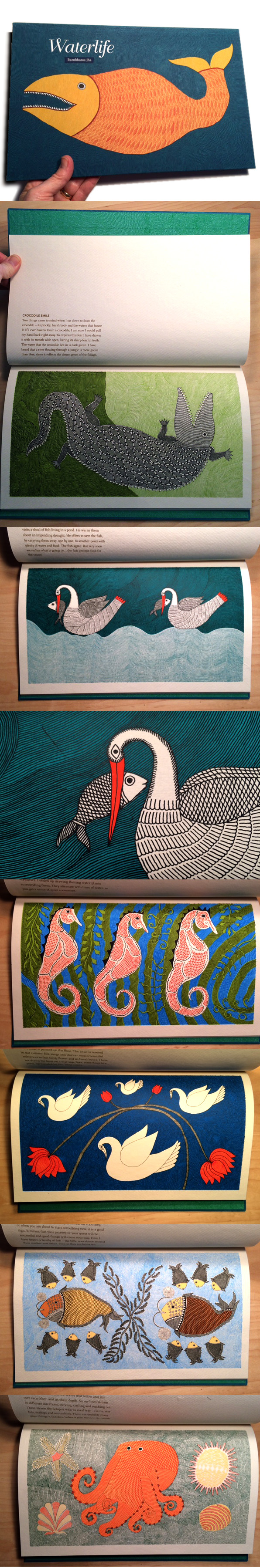
Waterlife is a very special book. It is fit for any child’s bookshelf or adult’s coffee table. Whereas there is no storyline in the traditional picture book sense, there is a story in its art and the making of the book. Illustrated in his version of the Mithila tradition of folk art, artist and author Rambharos Jha depicts several creatures of the water in 12 spreads. Each creature is accompanied by a few sentences describing its significance to his culture, his upbringing and his experience drawing it. Each of these briefs is rich with reference to a culture of symbols and motifs. Each one provides clues to the place that the creature has in Jha’s life and imagination. Collectively, they paint not only a picture of water life but the artist’s life.
The Trick
This is my picture-tribute to a well-known fable from the ancient Indian story collection, Panchatantra. A crane visits a shoal of fish living in a pond. He warns them of an impending drought. He offers to save the fish, by carrying them away, one by one, to another pond with plenty of water and food. The fish agree. But very soon we realize what is going on…the fish become food for the crane!
This is a limited edition book that has heirloom written all over it. Each illustration is made of a patient compilation of fine lines, textures and patterns, colored in the most luscious and restrained palette. Each illustration exhibits a charming innocence while at the same time a commanding mastery of the medium. Jha’s technique of finely woven lines makes each illustration hypnotically undulate as if it were alive. They are screen printed by hand on a highly textured hand-made cotton paper. They are printed and bound in India. This is a perfect gift book for a 6-year old, college graduate, or retiree.
The Sea
Marianne Dubuc | LO Editions 2012 | 64 pages

The Sea is a book for seeing. Marianne Dubuc has created a minimal book completely devoid of words and illustrated sparingly in two colors. It is a ‘journey’ book as we follow a determined feline in pursuit of a tireless flying fish. But this book is really about looking closely at the illustrations and making your own story. With 64 pages of patient and whimsically detailed graphite drawings, what’s not to like? There are jelly bean clouds, round house windows, a cat with a long nose, and of course a fish with popsicle stick-like wings. Marianne’s depiction of entering and existing space is priceless. This is a refreshingly different kind of book—very Italian and very lovely.
Oh No, George!
Chris Haughton | Candlewick Press 2012

Author of Little Owl Lost, Chris Haughton has published a new book about the travails of an undisciplined hound called Oh No, George! The story is simple—if left alone will a dog do as he says and be good? We know he won’t but we are drawn into the subconscious of George as he struggles with his own canine demons. Many of us say to our dogs, “be good” when we close the door, knowing they are just going to sleep. George does everything you fret except get into the liquor cabinet—but that’s another book. Against his own will, he devours the cake, the cat, and unearths the flowerbed. The fun in this book is Chris’ graphic and expressive style of drawing and coloring with his festive (Mexican) palette and super graphic scale. George is a bad dog, but not without redemption as told in the second half of the book.
The trailer is as cute as the book:
Thanks you Chris for sharing a few of your early sketches in making this devilish hound and strange owner.