Posts Tagged ‘36 pages’
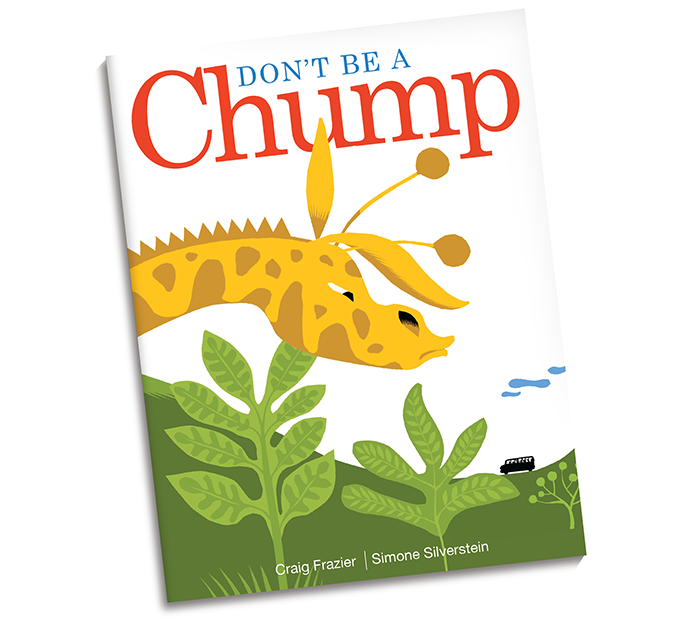
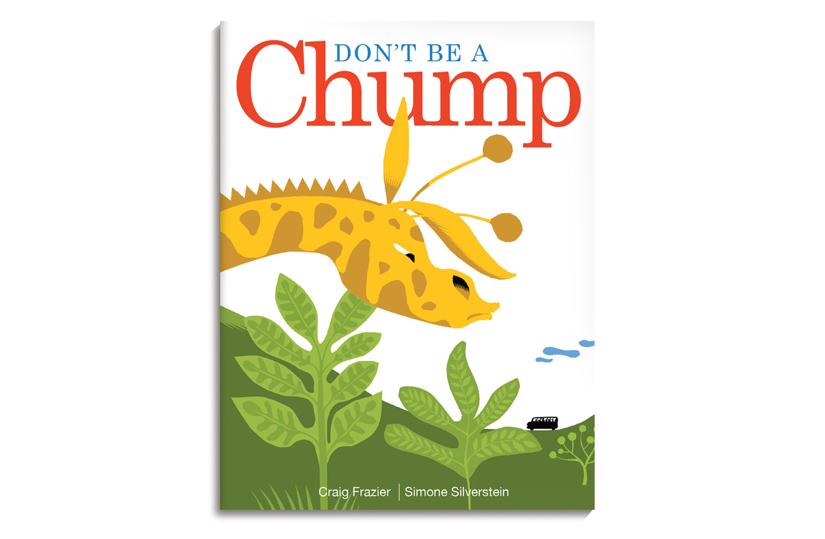
Don’t Be a Chump
Craig Frazier & Simone Silverstein | 36 pages | MouseType Press (self-published) | ebook
Partial book only shown below/ Buy ebook
Don’t Be a Chump looks at our current times in this country and the threat of one of our Presidential candidate’s hateful rhetoric. Bullying, lying and disparaging others is the behavior of a chump and is unacceptable, under any circumstances, for any age. However bad, this is a teachable moment for kids and parents. Though loosely fashioned around our election, the message of this book will live on long after.
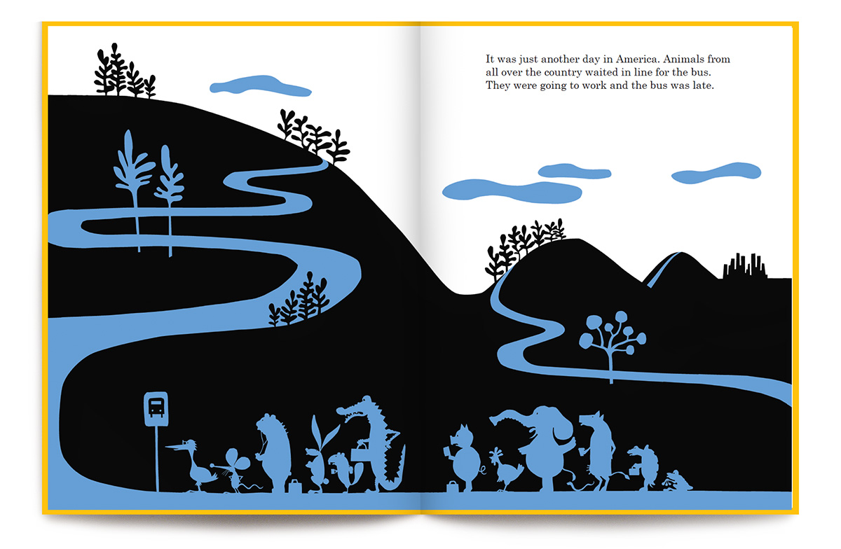
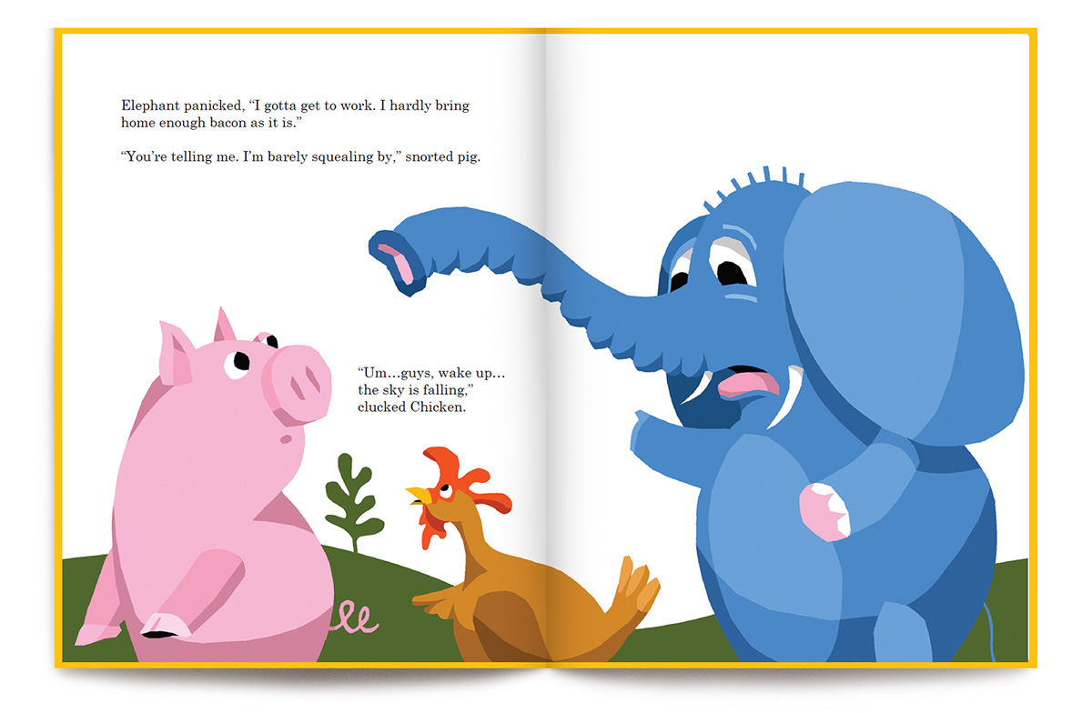
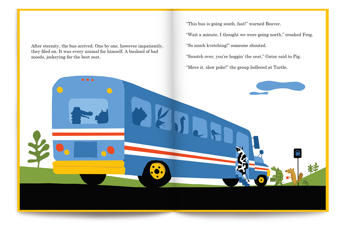
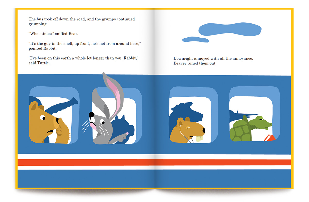
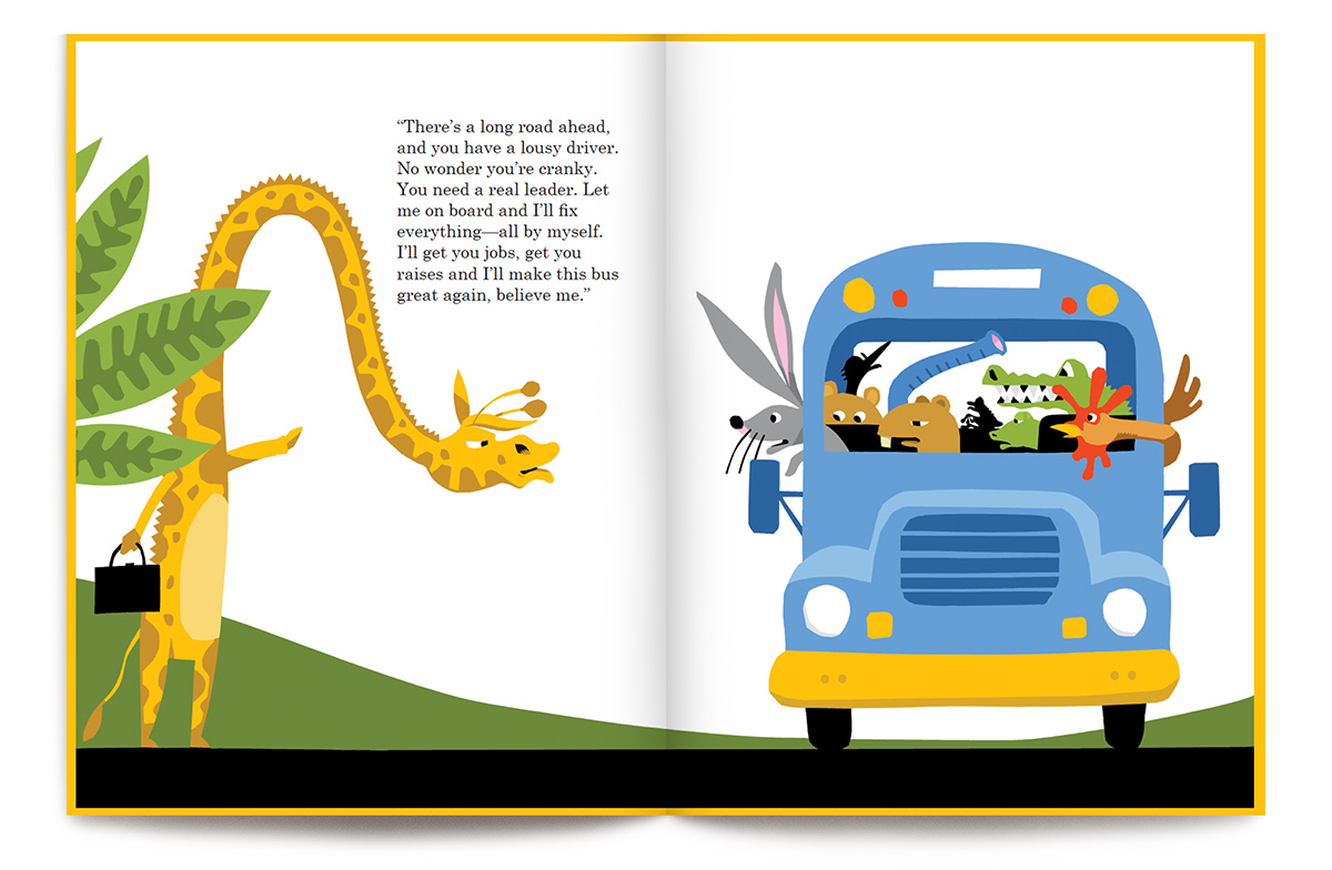
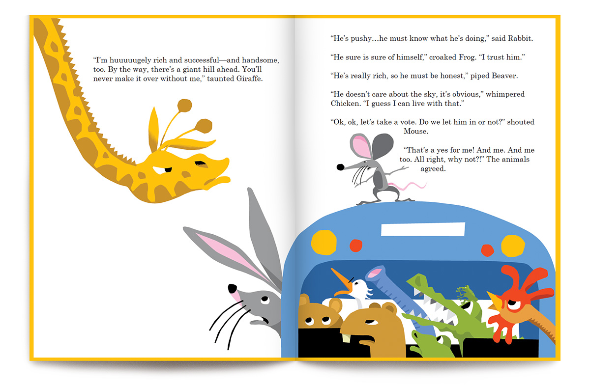
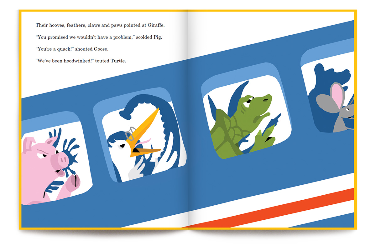
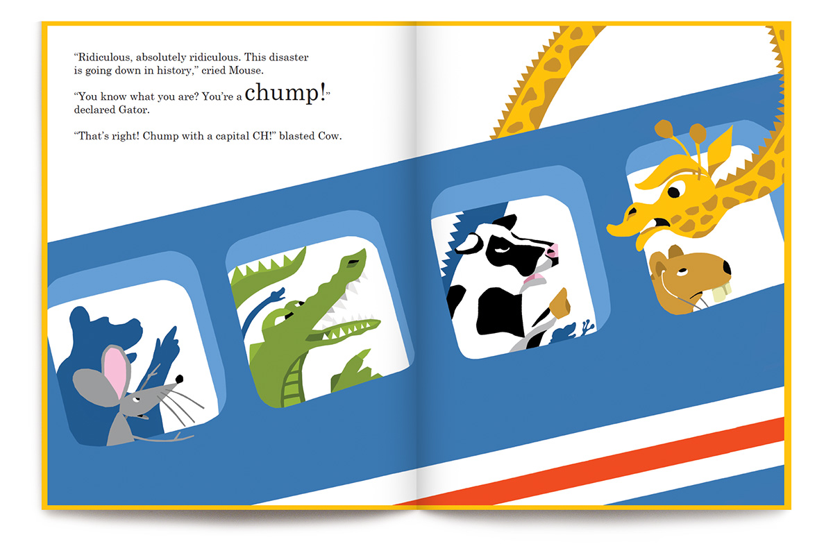
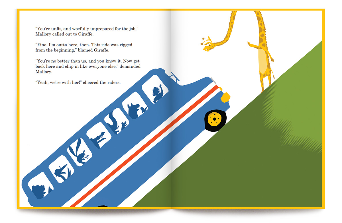
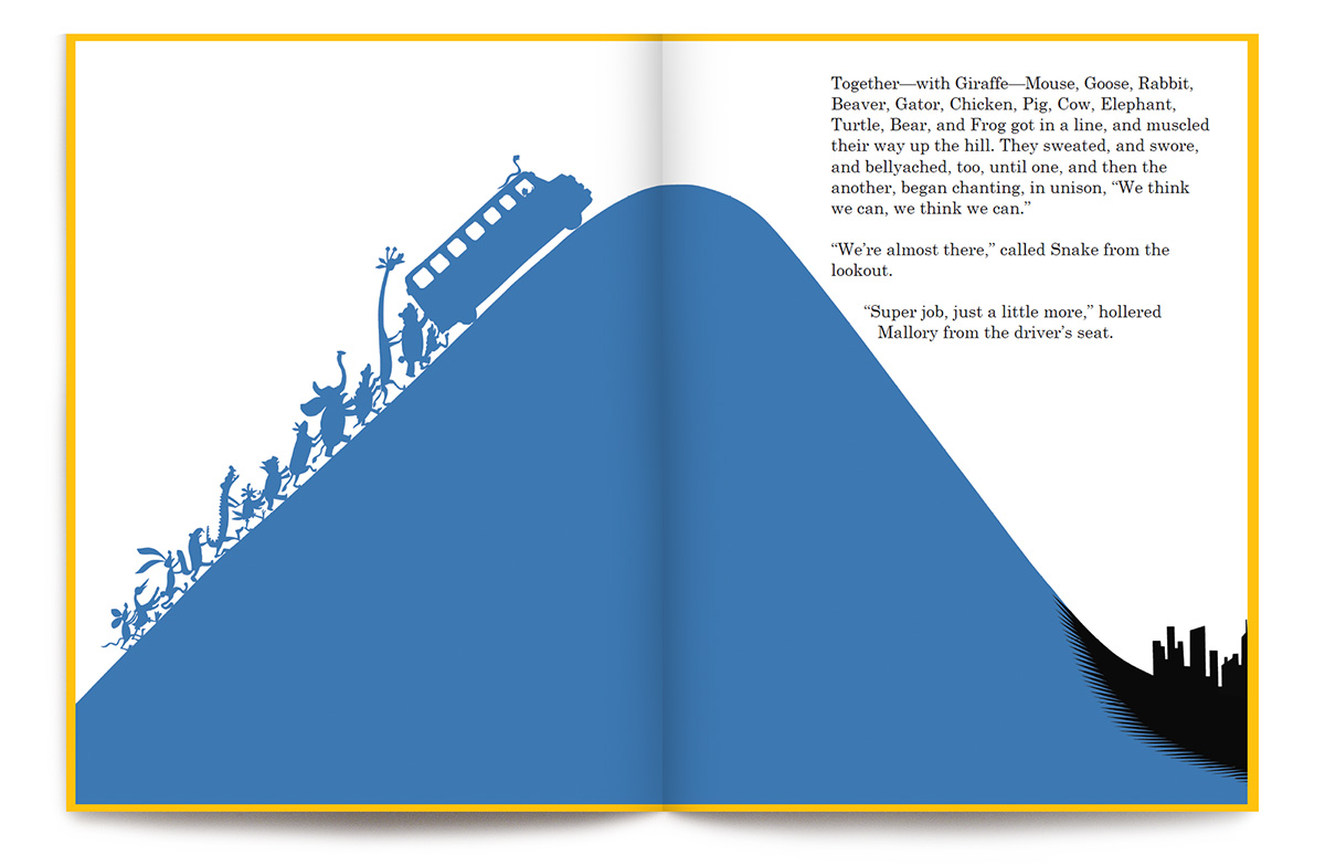
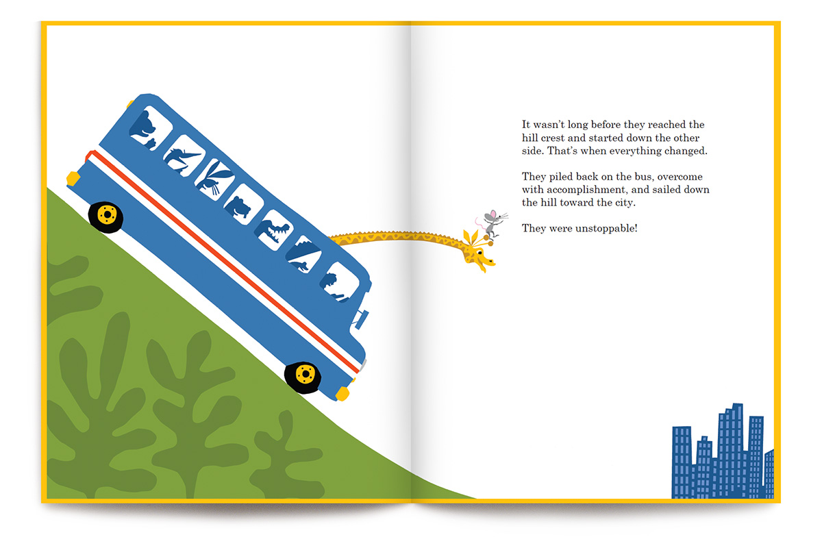
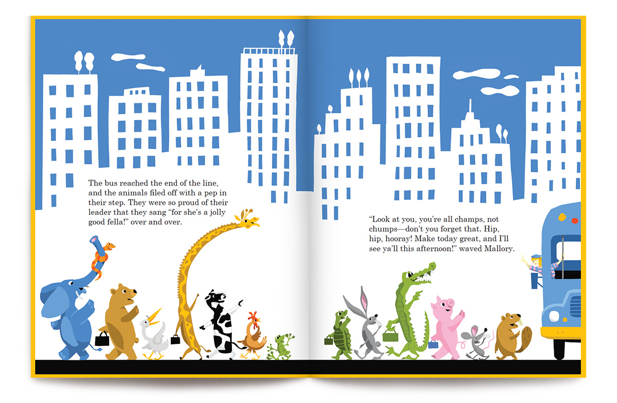
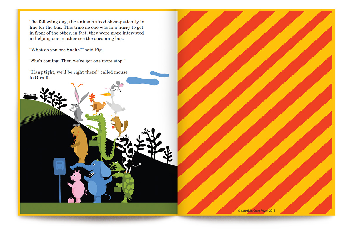
Disgruntled animals line up to get on the bus, each starting their day with frets and complaints. They come on to the lone Giraffe who bullies his way onto the full bus with his braggadocios remarks and the claim that he can “make this bus great again.” When the bus stalls and all mayhem breaks out, bus driver Mallory calms the passengers and lets them know they are starting to behave like the Giraffe (chump). She encourages their team participation in solving the problem. Together—with Giraffe—they push the bus over the hill. The animals refuse to be bullied and learn that no one is alone and cooperation and collaboration triumphs over anger and bullying.
This book is available as an ebook for download at Amazon.
Click on thumbnails to preview entire book.


Why 36 pages?

The answer is quite simple: most kid’s books have 36 pages devoted to text and illustrations. This number is because the printing process requires that books be printed in multiples of 8 pages called signatures. So, many books use 32 pages, but most use 40 pages. I prefer 40. Now, all of those pages aren’t necessarily available for imagery. Actually only 38 are available because 2 of them are glued down to the hard cover board, thus attaching the text pages to the book’s cover. The first and last pages of the book are called ‘end sheets’. They are fair game for anything–text, illustrations, words, patterns or textures. I tend to like to use them as subtle reference to the book’s colors and content. They are quite often wonderful as they act as wallpaper for the meat of the book. I will write a separate post on endpapers as they are worthy.
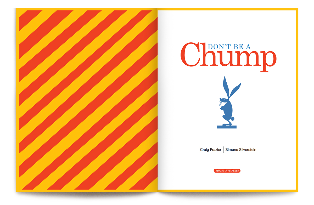
Of course, the first actual reading pages are usually the Library of Congress page (a boring and required page for lawyers and librarians), I like to put my dedications on this page. Straight across is usually the book’s title page. It’s for restating the title, author and publisher. As a rule, I never repeat the cover image, afterall, the reader’s already seen it.

Then there’s the cover—front and back. Most books have a ‘jacket’ or dust cover, which usually gets mangled in the first few readings in the hands of the excited kiddo. The jacket has ‘jacket flaps’ which hold the cover on and give us yet two more chances to wax on about the book and brag about the merits of the author and illustrator.
If you believe this jacket doesn’t last, as I do, you have yet another chance to design a front and back cover. I rather like the idea of a surprise cover so try not to duplicate the design on the jacket. That ‘inside cover’ is usually more understated and has less ‘shelf appeal’ as it doesn’t have to sell the book.
So, if you total up all the pages including covers, you have about 44 pages worth of visual real estate to exploit. So 36pages.com probably should have been called ‘about44pagesorso.com’