Archive for October, 2010
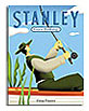
A Sick Day for Amos McGee
Written by Philip C. Stead & illustrated by Erin E. Stead | Roaring Brook 2010

A Sick Day for Amos McGee is a sleeper. It’s about the routine of life for Amos the zookeeper and his friends—the elephant, the turtle, the penguin, the owl and the rhinoceros. On the clock, Amos goes about befitting exchanges with each animal like reading to the owl and racing the turtle—until the day he gets a cold. Troubled and out of sync by his absence, his pals pile in the bus and get to his bedside to resume their individual routines. This is a sweet story about the rhythm of friendship and the comfort that comes with it.
I am struck by the perfect match of illustration style to the story, (not always the case). The illustrations by Erin Stead fit snuggly with her husband Philip’s carefully chosen words. Her subtle but firm graphite drawings take you into the wise crevices of Amos’ aged face as well as the caring eyes of each of his friends. Her confident drawings are judiciously punctuated with flat pastel color applied through woodblock printing. This book is all care and loving hands, cover to cover. What a joy it must have been for Erin and Philip to create. Just wonderful.
Why 36 pages?

The answer is quite simple: most kid’s books have 36 pages devoted to text and illustrations. This number is because the printing process requires that books be printed in multiples of 8 pages called signatures. So, many books use 32 pages, but most use 40 pages. I prefer 40. Now, all of those pages aren’t necessarily available for imagery. Actually only 38 are available because 2 of them are glued down to the hard cover board, thus attaching the text pages to the book’s cover. The first and last pages of the book are called ‘end sheets’. They are fair game for anything–text, illustrations, words, patterns or textures. I tend to like to use them as subtle reference to the book’s colors and content. They are quite often wonderful as they act as wallpaper for the meat of the book. I will write a separate post on endpapers as they are worthy.
Of course, the first actual reading pages are usually the Library of Congress page (a boring and required page for lawyers and librarians), I like to put my dedications on this page. Straight across is usually the book’s title page. It’s for restating the title, author and publisher. As a rule, I never repeat the cover image, afterall, the reader’s already seen it.

Then there’s the cover—front and back. Most books have a ‘jacket’ or dust cover, which usually gets mangled in the first few readings in the hands of the excited kiddo. The jacket has ‘jacket flaps’ which hold the cover on and give us yet two more chances to wax on about the book and brag about the merits of the author and illustrator.
If you believe this jacket doesn’t last, as I do, you have yet another chance to design a front and back cover. I rather like the idea of a surprise cover so try not to duplicate the design on the jacket. That ‘inside cover’ is usually more understated and has less ‘shelf appeal’ as it doesn’t have to sell the book.
So, if you total up all the pages including covers, you have about 44 pages worth of visual real estate to exploit. So 36pages.com probably should have been called ‘about44pagesorso.com’
13 Words
Lemony Snicket & Maira Kalman | Harper

There is only one way a book like this comes about—when two iconoclasts rub their minds together and record what happens. 13 Words is every bit a picture and wordbook for kids and adults alike. It fits all the criteria of a good kid’s book—nice story, well-illustrated—except that the story and illustrations are products of two big kids playing feverishly hard together—governed solely by what they think is good and satisfying work. It’s a different kind of book.
When asked what it was like to work with the other, Lemony (aka Daniel Handler) says of Maira Kalman, “an unfettered, digressional delight.” Maira says, “Daniel is a force of nature. I am quiet and point to things. He keeps me laughing. We walk around and look at things and talk about what we are thinking about and looking at.”
Their contribution to each other’s contribution is evident, yet begs the question who informed who first? Maira tells me, “Daniel and I talked about images that I liked and was interested in painting, then Daniel thought about images, then he wrote and I responded. A bit of back and forth, but then the manuscript was written and the final paintings came after that.” Daniel recounts, “the text came first, then got nudged around as the paintings continued.” A perfect partnership—both taking appropriate responsibility (and credit) for the creation and neither having the same recollection of how it happened. Whatever—it’s a beautiful thing.
The book revolves around 13 of what Daniel calls ‘oft-neglected’ words like despondent, and haberdashery and cake. They frame a tale of characters—a dog, baby, bird, goat and opera singer—that makes perfect sense as soon as you buy into a depressed bird painting eleven ladders with ten colors. Daniel owes a lot to Maira for making his words completely rational and probable. Maira owes equally to Daniel for writing prose that justifies her love of painting goats as if walking out of Barney’s. “The driver in the convertible is a goat. He is wearing a spiffy jacket.”
My favorite word in the book is panache. It describes Maira’s work perfectly. Every page is an illustration that bears tireless revisiting. Incredibly personal and interesting objects, jokes, references, innuendos, scenes and content—all painted with masterful color-sense and total disregard for perspective, light, scale or accuracy. They ooze the style, spontaneity and intuitiveness that every serious illustrator pines for. Maira calls it “a funny combination of work and not work.” Oh, that’s the secret.
What a duo—Maira and Lemony should start a band.

Maira and Daniel bribe patrons with ice cream, posters, and buttons at Cones in NYC.